


Namma Metro
Simplifying Daily Commute
Curious about the improvement? Let’s break down. But before diving into the details, here’s a quick overview.


₹25
Avg Fare
75%
Smartphone Users
745K
Avg Daily Riders
120K
Peak Time Riders
70
Metro Stations
02(65Km)
Current Metro Lines
05(108Km)
Future Metro Lines
60%
Working People
The whole picture
Reference Links:
Bangalore Metro Expansion Plans
• Source - Bangalore Metro Rail Corporation Limited (BMRCL)
• Summary - Comprehensive data on current and future metro lines, including operational details and proposed expansion plans.
Namma Metro Ridership Trends
• Source - The Hindu Article on Namma Metro Ridership
• Summary - Detailed insights into daily ridership statistics, peak-hour trends, and evolving commuter behavior.
Commuter Behavior and Mobility Patterns
• Source - Statista Report on Indian Commuter Habits
• Summary - In-depth analysis of device usage, age demographics, and daily commuting patterns among metro users.
Urban Mobility Impact of Metro Expansion
• Source - Economic Times
• Summary - Extensive reporting on new metro lines, strategic expansions, and their projected impact on urban mobility.
The real problem
Unreliable Real-Time Information
Problem: Train schedules, delays, and platform updates are either inaccurate or delayed, leaving commuters frustrated and uninformed.
QR Code and Payment Failures
Problem: Frequent malfunctions in QR code scanning and online payment systems disrupt travel flow, causing inconvenience during busy commutes.
Inadequate Accessibility Features
Problem: The app lacks sufficient support and accessibility features for users with visual, auditory, or mobility impairments, significantly limiting its inclusivity.
Confusing Metro Map and Navigation
Problem: The map and navigation tools are unintuitive and cluttered, making it hard for first-time or occasional users to plan routes effectively and confidently.
Limited Value Beyond Basics
Problem: The app only provides ticketing and schedule information, missing opportunities to include last-mile connectivity, or personalized recommendations etc.
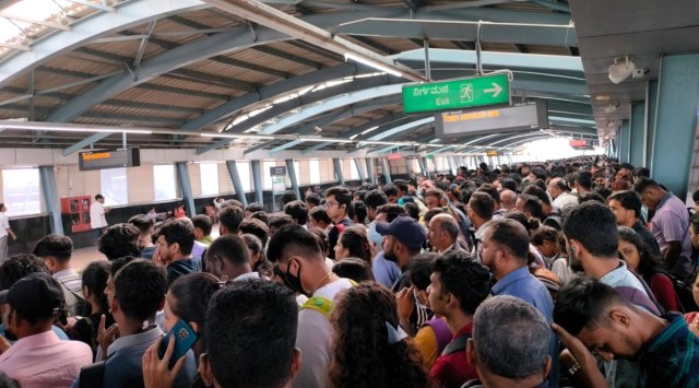
Insufficient Peak Hour Management
Problem: The metro system struggles to manage the high volume of riders during peak hours, leading to overcrowding, delays, and frustration for commuters.
My Role & Collaborators
I facilitated the research process, collaborating with design mentees to validate usability issues while independently crafting the design strategies and solutions for Bengaluru’s Namma Metro system. My approach focused on addressing persistent pain points and anticipating future complexities with the ongoing expansion of five new metro lines. While mentees contributed during the evaluation phase, I strategically led the heuristic evaluation, problem identification, and solution design to ensure real commuter needs were met. The resulting designs are scalable, user-centric, and align with the future growth of the metro system.
Now, let's evaluate, the heustric way!
To address Namma Metro’s usability challenges, the app was divided into four core sections, where key issues were identified using Nielsen’s Heuristics and paired with actionable solutions, including a bold primary color palette to future-proof the app for new lines while aligning with Namma Metro’s design and Android guidelines. Let’s explore each section in detail -

Previous Design
Highlights the Live Updates button, giving users access to real-time details, and service alerts for better travel planning.
Draws focus to the interactive map, featuring live location tracking and clear metro routes.
Draws focus to the interactive map, featuring live location tracking and clear metro routes.
Updated Design
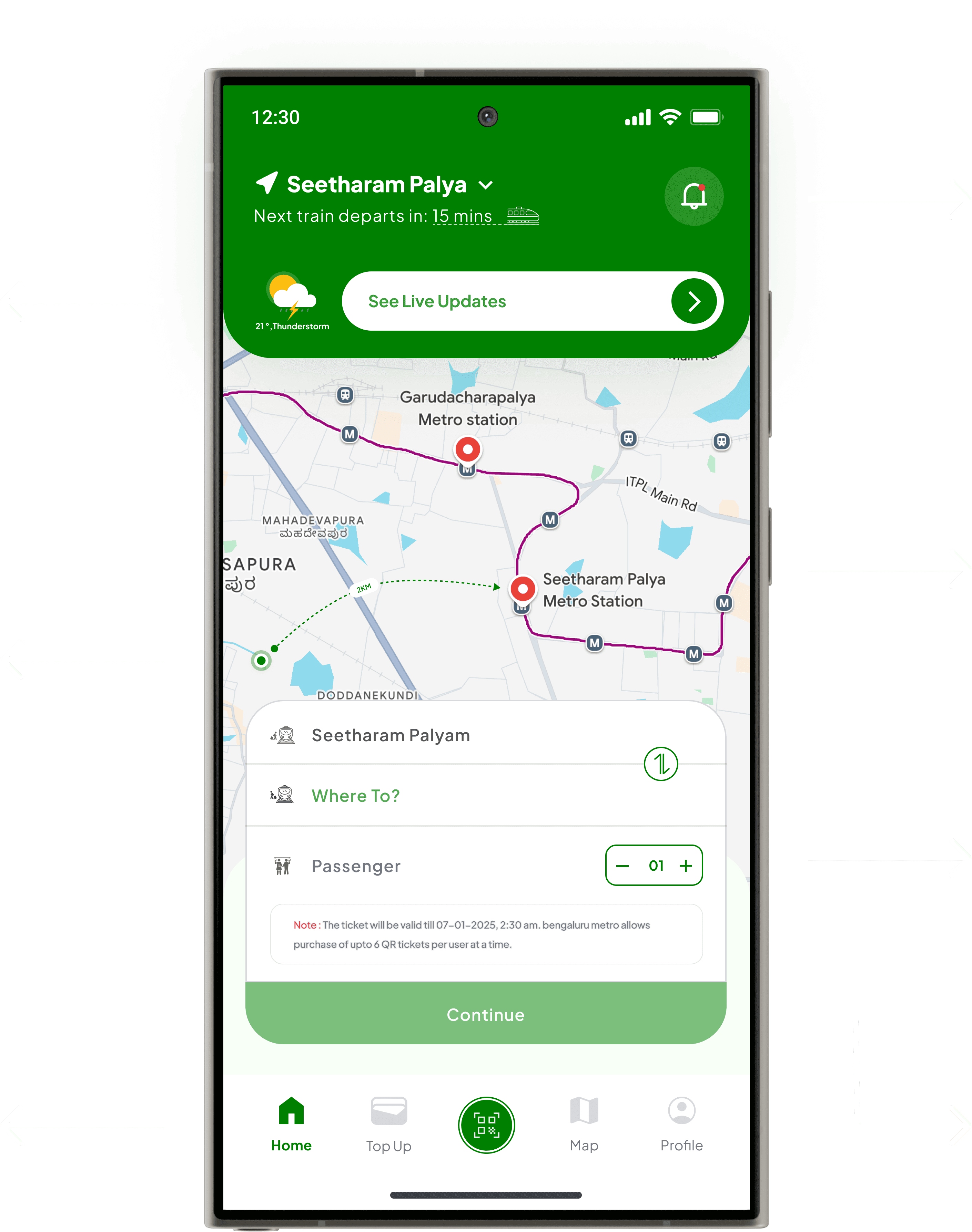
Focuses on the current station information and next train departure time, along with the notification icon, ensuring users stay informed about updates.
Emphasizes the map’s responsive interactivity, allowing zooming, and route selection directly.
Highlights the station selection and passenger details, enabling quick planning, with a brief disclaimer for clarity on ticket.
Highlights the disabled “Continue” button when the destination is not selected.
Home Screen
Problems : What’s wrong?
Visibility of System Status :
The home screen lacks real-time updates, leaving users uninformed about train schedules, delays, or platform changes. This absence of critical, time-sensitive information diminishes user trust in the app’s reliability.
Aesthetic and Minimalist Design :
The current design appears cluttered, with inconsistent iconography, excessive use of bright colors, and poorly defined visual hierarchies. This overwhelms users and complicates navigation.
Recognition Rather than Recall :
Menu labels such as “Time Table” and “Fare Info” are too generic, requiring users to recall their purpose. This creates friction, especially for first-time or infrequent users unfamiliar with the app’s structure.
Changes : What did we change to fix it?
Visibility of System Status
Previously : No real-time updates, no information about train schedules or disruptions.Updated :
Added a Next Train widget displaying real-time train departures.
Introduced a Live Updates button for real-time schedules, platform details, and service alerts.
Integrated a notification system to highlight service disruptions or delays.
Aesthetic and Minimalist Design
Previously : Cluttered layout with inconsistent icons and excessive bright colors.Updated :
Reorganized secondary features (e.g., Top Up, Map, Account) into a bottom navigation bar for a cleaner, modern interface.
Highlighted QR Code generation as a primary action with a prominent central position in the navigation menu.
Adopted a consistent green-and-white color palette and cohesive iconography, ensuring scalability for future metro lines while representing Bengaluru as the Garden City and its commitment to sustainability.
Recognition Rather than Recall
Previously : Generic menu labels like “Time Table” required users to remember their purpose.Updated :
Added descriptive labels like “Where To?” for clarity.
Integrated an interactive map with live location and route visualization to help users visually recognize stations
Outcomes : What improved?
Enhanced System Status Visibility
Real-time train updates and alerts increased user trust and helped in better travel planning.
Notifications ensured users stayed informed about service disruptions or delays.
Streamlined and Modernized Design
A cleaner, minimalist interface improved navigation and usability.
Consistent green-and-white color palette established a unified brand identity, aligning with Bangalore’s representation.
Improved Recognition and Usability
Clearer labels and an interactive map reduced cognitive load, enabling quicker decision-making.
The prominent station selection section made ticket booking intuitive and seamless.


Previous Design
Highlights the toggle to switch between “Top-Up” and “Add Card” tabs for easy navigation.
Highlights the View Details of the metro card, allowing users to unmask card details for use in third-party apps when needed.
Highlights the Slide to Pay feature for seamless and intuitive payment completion.
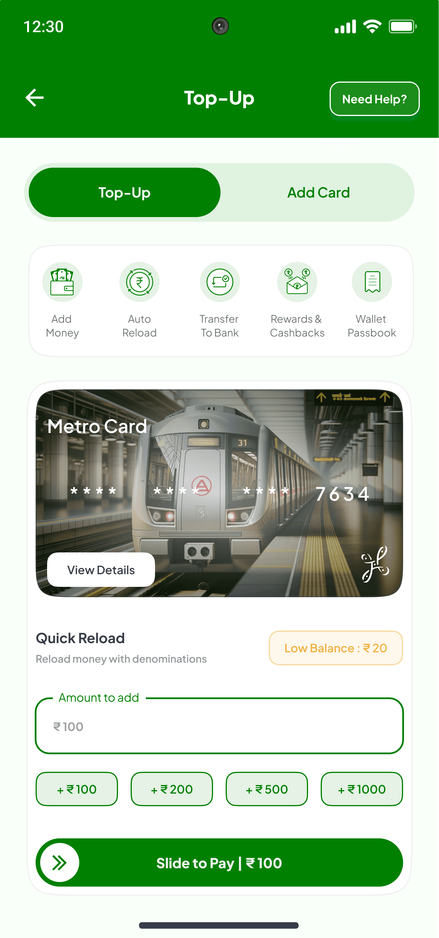
Updated Design
Points to the “Need Help?”, which ensures quick access to customer support or FAQs, enhancing user assistance for any issues.
Draws attention to interactive top-up options, enabling efficient wallet management.
Highlights the Quick Add section, showing the wallet balance with a Low Balance indicator to prompt users to top up seamlessly.
Highlights denomination options and a custom amount field for flexible top-ups.
Top-Up Screen
Problems : What’s wrong?
Visibility of System Status :
The old design lacks clear visibility of essential wallet details like available balance, transaction history, or card status. This leaves users unsure about their financial standing and recent actions.
Aesthetic and Minimalist Design :
The existing design appears cluttered and outdated, with inconsistent visual hierarchy and limited focus on user-centric actions, such as quick top-ups or reviewing wallet details.
Recognition Rather than Recall :
Key actions, such as adding money or checking card details, require users to recall previous information instead of being easily accessible upfront, leading to usability issues.
Changes : What did we change to fix it?
Visibility of System Status
Previously : Users lacked clear visibility of wallet balance, card status, and recent transactions.Updated :
Introduced a Metro Card widget showing wallet balance, card number, and status.
Added a Low Balance indicator to alert users when their balance drops below the threshold
Incorporated Quick Add options for seamless top-up with preset denominations.
Aesthetic and Minimalist Design
Previously : The layout was cluttered, with redundant elements and insufficient prioritization of features.Updated :
Reorganized the layout into sections: Top-Up, Add Card, and Transaction History for better navigation.
Redesigned the interface with a consistent green-and-white color palette, visually aligning with metro branding.
Integrated icon-based shortcuts for essential features, enhancing usability and reducing visual overload.
Recognition Rather than Recall
Previously : Users had to navigate multiple screens to access transaction history or perform actions.Updated :
Displayed core actions upfront, such as Add Money, Transfer to Bank, and Setup Auto Load.
Added a dedicated Transaction History tab for tracking previous top-ups.
Included a View Details button for accessing full card information directly.
Outcomes : What improved?
Enhanced Wallet Visibility
The metro card display now provides a centralized view of balance and status, ensuring users can quickly check their wallet without navigating multiple screens.
Streamlined Top-Up Process
The addition of quick add options and the slide to pay feature simplifies the top-up process, reducing time and effort for users.
Improved Flexibility
Clearer labels and an interactive map reduced cognitive load, enabling quicker decision-making.
The prominent station selection section made ticket booking intuitive and seamless.
Integration with external apps
The view details button enables users to unmask card details, allowing easy use in third-party apps without compromising security.
Actionable Balance Alerts
The low balance indicator proactively informs users, ensuring they can top up in advance and avoid interruptions.
Actionable Balance Alerts
The toggle between “Top-Up” and “Add Card” tabs makes navigation intuitive, catering to users who manage multiple cards or need to switch actions quickly.
Previous Design
Highlights trip details, offering comprehensive route information, including the location of the ladies’ coach and other relevant trip-specific details to help user.
Highlights Payment Details, providing clear information about the mode of payment and transaction for transparency.
Updated Design
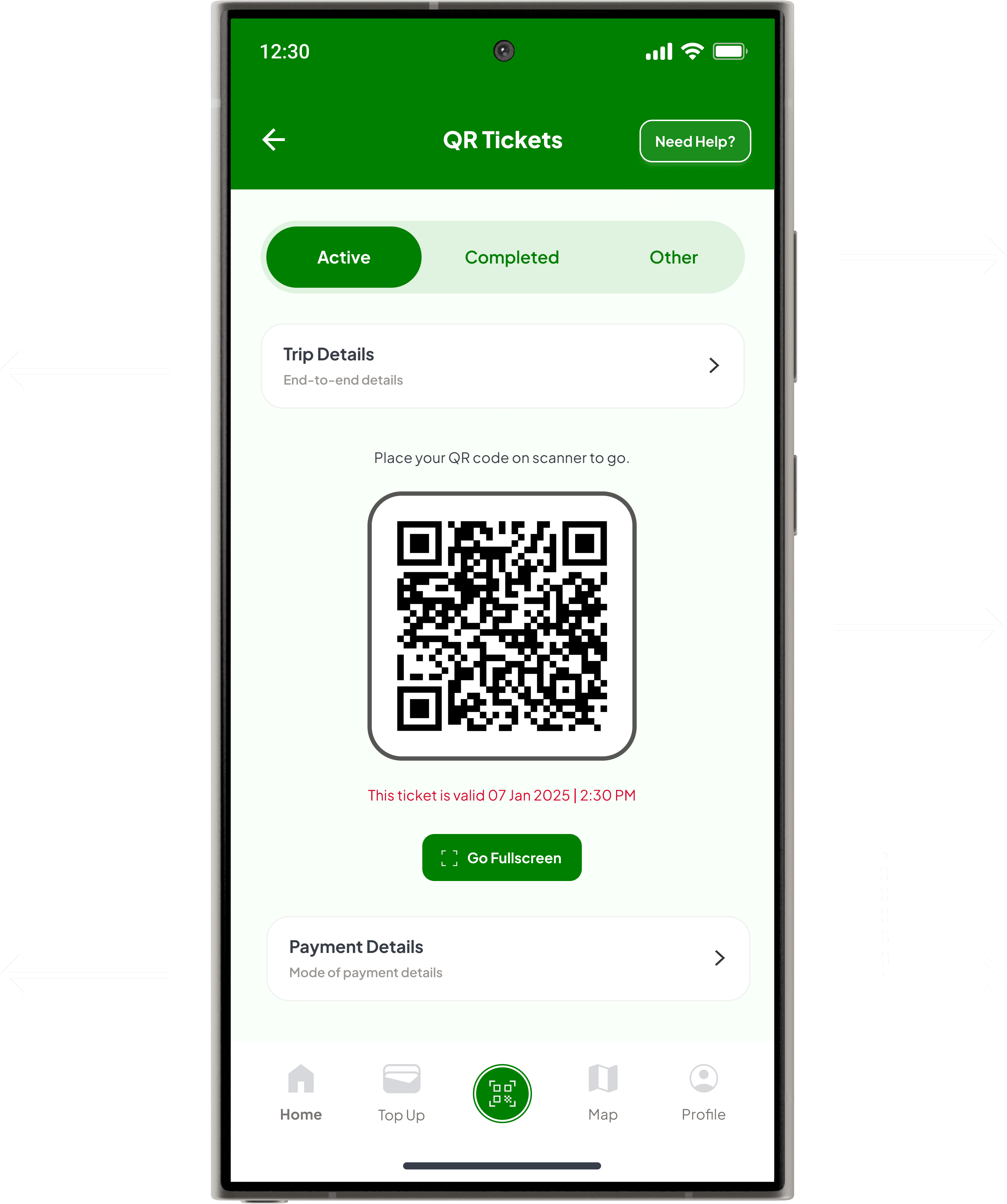
Highlights the swappable toggle, enabling users to seamlessly switch between categories, ensuring clear navigation.
Highlights the QR Code with a time-sensitive validity indicator for easy scanning and awareness of expiration.
Indicates the Go Fullscreen option, enhancing accessibility for seamless QR code scanning.
QR Ticket Screen
Problems : What’s wrong?
Visibility of System Status :
Users could not easily identify critical ticket details such as trip information, payment status, or ticket validity. The QR code itself was not prominently displayed, leaving users uncertain about their active tickets. Accessing these details required clicking the “View Ticket” button, introducing unnecessary layers and complexity to the process.
Recognition Rather than Recall :
Users had to remember ticket validity, payment details, and trip information since these were not readily displayed. This increased cognitive load and disrupted usability, particularly for users who needed quick access to this information.
Consistency and Standards :
The previous design attempted to handle two tasks—QR code access and ticket purchase—within one screen. This broke consistency and made the interface confusing, as users expect screens to focus on one purpose at a time.
Flexibility and Efficiency of Use :
The design did not cater to frequent users who needed quick shortcuts or a streamlined workflow for tasks like accessing active tickets or scanning QR codes.
Aesthetic and Minimalist Design :
The old design was cluttered and lacked visual hierarchy. The QR code was not treated as the primary focus, making the interface overwhelming and less intuitive.
Changes : What did we change to fix it?
Visibility of System Status
Previously : Key ticket details were tucked behind the “View Ticket” button, adding unnecessary steps.Updated :
Placed the QR code prominently at the center of the screen.
Added Trip Details and Payment Details directly around the QR code for easy access.
Highlighted ticket validity with an expiration note, ensuring users are aware of their ticket status at a glance.
Recognition Rather than Recall
Previously : Users had to navigate layers and recall ticket details, increasing cognitive load.Updated :
Introduced tabs for ticket categories: Active, Completed, and Other, allowing users to locate their tickets without relying on memory.
Organized trip and payment information with clear labels like “Trip Details” and “Payment Details.”
Consistency and Standards
Previously : The screen mixed unrelated tasks (QR code access and ticket purchase), breaking focus and consistency.Updated :
Focused the screen exclusively on QR ticket management, removing unrelated features like the purchase flow.
Ensured consistency by aligning with standard UI practices, such as tabbed navigation for ticket categories.
Flexibility and Efficiency of Use
Previously : The design lacked shortcuts for frequent users, making repetitive tasks like QR scanning cumbersome.Updated :
Designed tabbed navigation to let users quickly switch between ticket categories.
Added a “Go Fullscreen” option for efficient QR scanning, catering to users who want a streamlined experience.
Aesthetic and Minimalist Design
Previously : The cluttered layout lacked focus and hierarchy, making navigation overwhelming.Updated :
Simplified the layout, with the QR code as the primary focus.
Used a consistent green-and-white color palette to align with metro branding.
Separated sections clearly for trip details, QR codes, and payment information, enhancing readability.
Outcomes : What improved?
Enhanced Wallet Visibility
Key ticket details such as trip information, ticket validity, and payment status are now visible at a glance. Users no longer need to navigate layers to find this information.
Streamlined and Consistent Interface
The screen is now focused solely on QR ticket access, removing distractions like ticket purchase functionality. This provides a cleaner and more intuitive experience.
Reduced Cognitive Load
Tabs for Active, Completed, and Other tickets, along with clear labels, ensure users can easily locate their tickets without relying on memory.
Improved Efficiency for Frequent Users
The “Go Fullscreen” option simplifies QR scanning, and tabbed navigation provides quick access to different ticket categories.
Modern and Minimalist Design
The redesigned interface emphasizes the QR code, with clear visual hierarchy and consistent branding, improving user satisfaction and engagement.
Previous Design
Points to the zoomable map, offering a detailed and interactive view of metro routes, ensuring better navigation and control.
Points to the Slide Map interaction, requiring user intervention for map interaction, minimizing doubts and accidental interactions.
Highlights route details along with the total stops, providing users with a comprehensive view of the operational route.
Highlights the Upcoming Lines (05) section, providing users with details about future metro routes.
Provides minimal but essential information like distance and status, based on available government data.
Updated Design
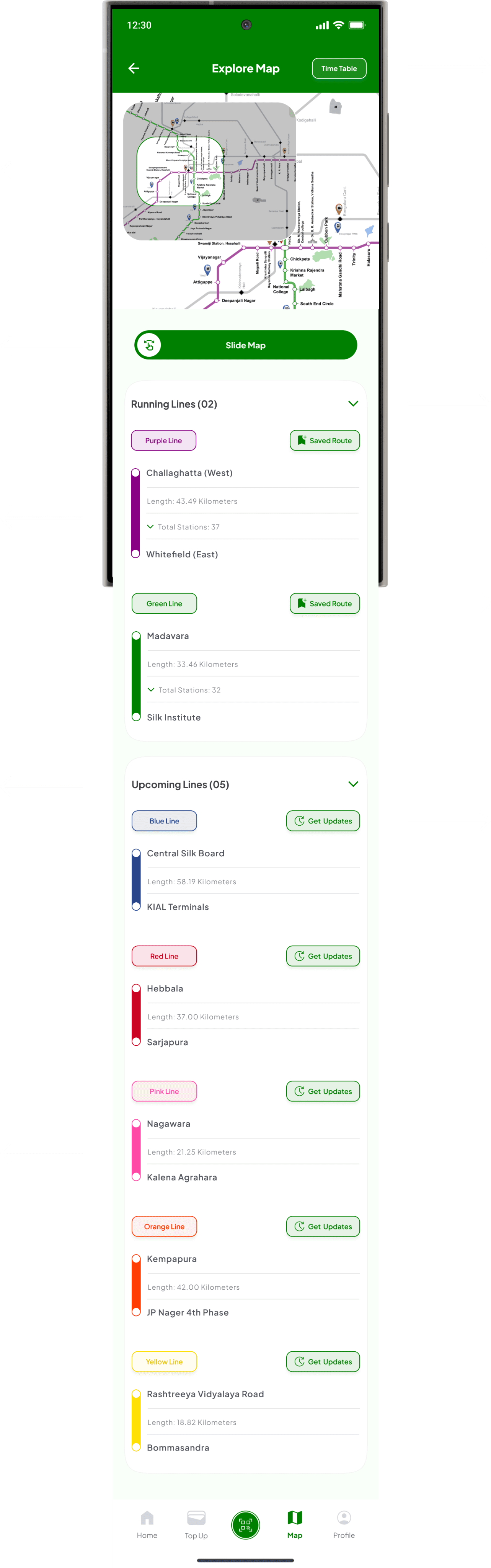
Provides users with quick access to standard schedules and static time information, separate from live updates.
Points to the operational map, displaying current metro routes for quick reference and navigation.
Highlights the Running Lines section with numbers and an accordion for quick access.
Highlights the Saved Route feature and line tag, helping users quickly identify their preferred routes and corresponding metro lines.
Highlights the Get Updates button, allowing users to receive real-time information about future metro routes and developments.
Map Screen
Problems : What’s wrong?
Visibility of System Status :
The old map failed to clearly distinguish between running and upcoming lines, lacked real-time updates, and buried key details like station counts and route statuses, leaving users unsure about operational information.
Match Between System and the Real World :
The map did not include familiar features like time tables or realistic route visuals, which are standard for metro systems, making it harder for users to relate it to real-world expectations.
User Control and Freedom :
Automatic switching to landscape mode disrupted the user experience and removed their control over navigation, limiting their ability to explore the map freely.
Consistency and Standards :
The slide interaction for maps was identical to payment slides, causing confusion, while the overall map layout did not meet modern app navigation standards.
Recognition Rather Than Recall :
Users had to rely on memory to recall metro line details, station names, and updates as the old design lacked interactive prompts, clear labels, and actionable options.
Aesthetic and Minimalist Design :
The map’s cluttered layout, with no hierarchy to separate running and upcoming lines, overwhelmed users and made navigation visually unappealing.
Changes : What did we change to fix it?
Visibility of System Status
Previously : Users couldn’t differentiate between running and upcoming metro lines or access real-time updates.Updated :
Added collapsible sections for Running Lines and Upcoming Lines, displaying station counts, route lengths, and live statuses.
Introduced actionable buttons like Save Route and Get Updates to make operational statuses more accessible.
Match Between System and the Real World
Previously : The map lacked metro schedules and real-world route representations.Updated :
Added a Time Table button at the top for quick access to static schedules.
Aligned the map design with real-world metro visuals, using color-coded lines and station labels.
User Control and Freedom
Previously : Auto-landscape mode restricted user interaction and disrupted navigation.Updated :
Introduced a Slide Map feature, allowing users to toggle between detailed and overview maps manually.
Enabled zooming and panning for seamless map exploration at the user’s pace.
Consistency and Standards
Previously : Similar slide gestures for maps and payments caused confusion, while the map design lacked modern navigation standards.Updated :
Differentiated the Slide Map icon to visually distinguish it from payment slides.
Organized the map layout into collapsible sections with clear labels and actionable buttons for a consistent user experience.
Recognition Rather Than Recall
Previously : Users had to rely on memory to recall line details and station information.Updated :
Added labeled toggles for Running Lines and Upcoming Lines, displaying essential details like station counts and route lengths.
Included actionable buttons like Save Route and Get Updates to simplify information access.
Aesthetic and Minimalist Design
Previously : The map layout was cluttered and lacked visual hierarchy.Updated :
Used collapsible sections to organize running and upcoming lines clearly.
Adopted a consistent green-and-white palette with color-coded lines for a clean and visually balanced design.
Outcomes : What improved?
Enhanced Visibility of Operational and Upcoming Lines
Clear separation of Running Lines and Upcoming Lines, with collapsible sections displaying station counts, route lengths, and status updates, ensures users can easily access relevant information.Streamlined User Control and Interaction
The Slide Map interaction puts users in control, eliminating automatic actions and reducing confusion, while the zoomable map provides a more intuitive navigation experience.
Improved Real-World Alignment
Features like the Time Table and realistic operational map visuals align with user expectations, bridging the gap between the app and real-world metro navigation.
Support for Informed Decisions
The Get Updates button and detailed upcoming line information provide transparency and actionable insights for planning future travel.
Minimalism and Scalability
The organized layout with collapsible sections reduces visual clutter, while the inclusion of government-provided data ensures the app remains scalable as new metro lines are added.
Improved Recognition and Usability
Features like Saved Routes and labeled sections reduce cognitive load, enabling users to easily find and act on important route details without recalling past information.

Post Destination
Highlights that once the user selects a destination, the “Continue” button becomes enabled to proceed further.
Highlights the interactive map, showing the route from source to destination with zoom for clarity.
Review Trip
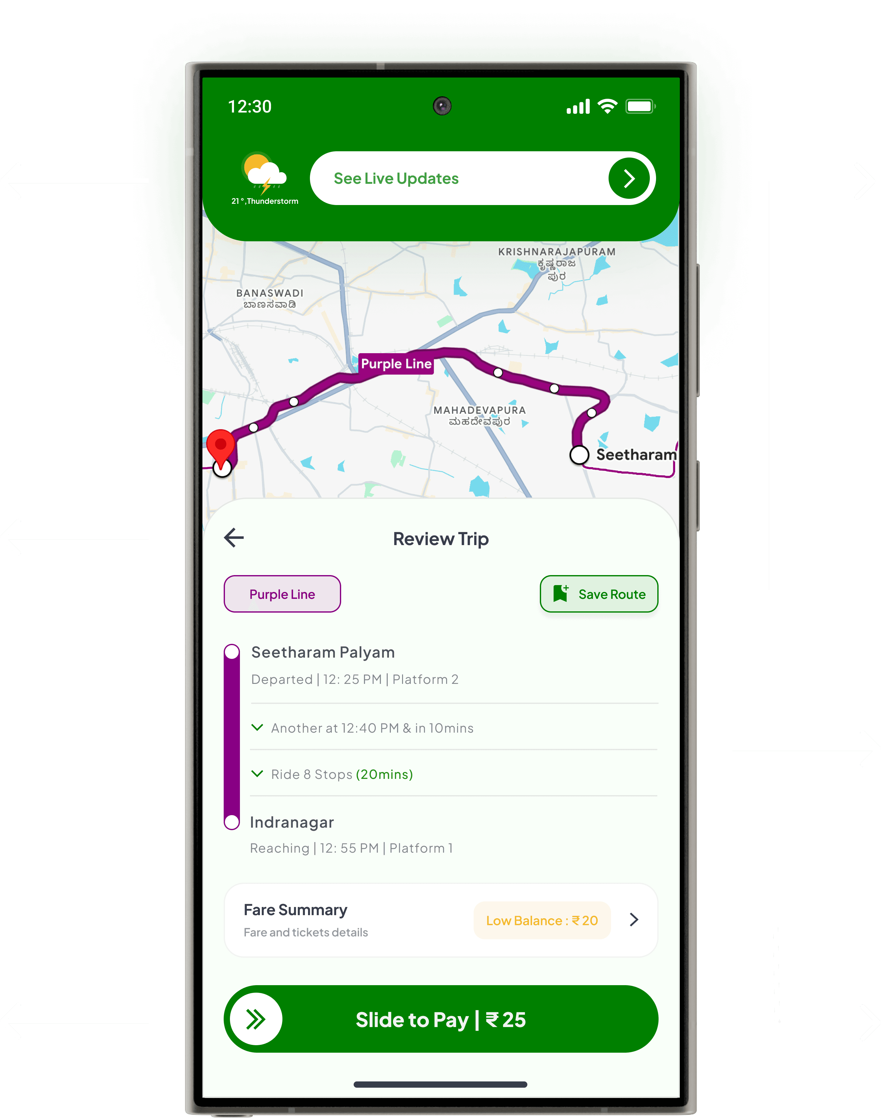
Focuses on the trip summary, detailing departure times, arrival times, number of stops, and platform information.
Highlights the fare summary, displaying ticket cost and wallet balance with a “Low Balance” prompt for quick top-up.
Explains the “Save Route” button and Purple Line tag, enabling users to bookmark frequently traveled routes while identifying the corresponding metro line for better navigation and future use.
Highlights the live status of metro lines, replacing location and other details from the Home Screen to focus solely on real-time updates.
Ensures seamless payment, redirecting to the Top-Up page if the balance is insufficient, else it will generate the QR Code.
Intermediate Flow
Once the destination is selected, the experience flows naturally from the Home Screen into the interactive map view, providing users a clear visualization of their route. Following this, the journey transitions into the Review Trip screen, where users finalize essential details like the route, fare, and passenger count before moving forward. This seamless progression ensures clarity and keeps the user focused on completing their booking.
Beyond Heuristics - Value Addition
While heuristic evaluations address usability and design flaws, certain enhancements go beyond traditional principles to add value to the overall user experience. These features are designed to align with modern user expectations, improve engagement, and future-proof the app.
The live updates screen complements the previously covered features, such as QR tickets, map navigation, and top-up, by offering real-time, actionable data. With live train schedules, traffic patterns, and personalized recommendations, it equips commuters with the tools they need for better planning and decision-making. The layout ensures critical information is presented clearly and accessibly, enhancing the overall usability of the app.

Points to the Back Button and weather icon, retaining a familiar design for consistency.
Offering a personalized touch with weather updates and travel suggestions.
Highlights the traffic graph with hourly updates, providing a clear view of traffic patterns.
Offers quick access to hourly reports, heat maps, and saved routes for trip planning.
New Design
Points to the nearest metro location with notification, maintaining consistency with the home view for a smooth transition.
Emphasizes the map’s responsive interactivity, allowing zooming, and route selection directly.
Highlights live passenger traffic data to help users make informed travel decisions.
Live Updates
What It Adds :
Provides real-time train schedules, traffic patterns, platform details, and alerts for service disruptions, empowering users to plan their trips effectively and confidently.
Key Design Features :
Prominent Placement :
Positioned as a dedicated screen, accessible directly from the Home Screen header for quick navigation.
Live Traffic Visualization:
Displays hourly traffic updates with interactive graphs for current, peak, and usual traffic trends.
Personalized Interaction :
Includes greetings with weather updates and actionable travel tips tailored to the user’s day and location.
Supplementary Features :
Offers quick access to tools like hourly reports, heat maps, saved routes, and personal timelines for an enhanced user experience.
Why It Matters :
Trust Building :
Positioned as a dedicated screen, accessible directly from the Home Screen header for quick navigation.
User Empowerment :
Reduces uncertainty during peak hours or delays by offering actionable insights and predictive data.
Enhanced Engagement :
Adds value beyond functional use by integrating personalized and interactive features, ensuring the app remains an indispensable part of daily commutes.
Wrapping it up : The Lessons!
Designing Namma Metro was an opportunity to address the unique challenges of urban transit, combining research-driven insights with thoughtful design solutions to enhance the commuting experience. From tackling edge cases like expired QR codes and payment failures to introducing intuitive live updates and traffic insights, every feature was crafted with accessibility, usability, and commuter-centric needs in mind.
This case study emphasizes the importance of understanding user pain points and designing solutions that simplify navigation, ensure consistency, and foster trust. By focusing on clarity, responsiveness, and inclusivity, the app offers a seamless journey for users navigating the complexities of metro travel.
Beyond this project, the findings raise interesting questions about the future of urban transit apps, particularly how technologies like NFC, AR, and AI can elevate user experiences. These lessons can inspire innovative solutions in other sectors where efficiency and user engagement are critical.
I’d love to hear your thoughts—share your feedback, suggestions, or critiques. Or, dive into the previous case study to explore more examples of impactful design in action.
Challenges? Definitely!
Balancing Evaluation and Design Translation
Challenge - The major challenge was translating heuristic evaluation findings into actionable design solutions while keeping research results, user needs, and accessibility in focus. The key difficulty lay in ensuring the design addressed usability issues effectively without overwhelming users, especially given the varied requirements of metro commuters.
How I Overcame It - To tackle this, I designed features that were both inclusive and approachable, ensuring cognitive load remained low while maintaining a visually engaging interface. This involved simplifying navigation, optimizing workflows, and incorporating accessibility principles. By iterating on these designs and testing for inclusivity, I ensured that the final solution aligned with commuter needs while maintaining a seamless user experience.
Addressing Edge Cases Thoughtfully
Challenge - Edge cases, while uncommon, have a significant impact on user experience and trust if not handled effectively. The real challenge lay in identifying potential edge scenarios early, ensuring they didn’t disrupt the primary user flow, and creating seamless solutions that addressed rare but critical problems without overcomplicating the design.
How I Overcame It - To tackle these, I proactively mapped user journeys and identified points where edge cases could arise. While user behaviors vary and many edge cases were possible, I focused on the major ones where failures were most likely. This approach not only resolved critical issues but also maintained the overall simplicity and usability of the design, specifically addressing expired QR codes, lost connections, payment failures, and empty states.
Designing the Live Update Feature
Challenge - The challenge was to design a live update feature that prioritized relevant data to help users make quick decisions, while also presenting additional useful information without overwhelming them. The goal was to ensure that the information provided was actionable and user-centric.
How I Overcame It - To address this, I incorporated a live weather report and traffic update graph, as research showed these were the two primary factors influencing users’ decisions to use the metro. Additionally, I included a live indicator showing the number of people on the metro, giving users a clear understanding of how busy it was. This combination of actionable insights allows users to make quick, informed decisions while keeping secondary data accessible but unobtrusive.
Addressing Map Accessibility
Challenge - The initial map design presented several challenges. The sudden horizontal expansion overwhelmed users, leading to high cognitive load. The static nature of the map limited interaction, hindering exploration. Moreover, the map lacked clarity, making it difficult to understand lines, stations, and their interconnections, potentially creating accessibility issues for users.
How I Overcame It - To address these challenges, I designed a sliding interaction, inspired by how users intuitively scan seats while booking movie tickets (leveraging Jakob’s Law and considering user mental models), to improve usability and accessibility. I also enhanced clarity by displaying current and future metro lines with distinct colors, along with metadata like total stops and a “Check Updates” CTA. These improvements provide users with a clearer understanding of the system’s current and future expansion, making navigation more intuitive and accessible.
Future directions : Expanding possibilities
As the Namma Metro app evolves, there are several opportunities to introduce new features and address emerging user needs. These future directions focus on tackling operational challenges, enhancing commuter engagement, and broadening the app’s capabilities to meet diverse transit requirements. By exploring these possibilities, the app can maintain scalability, efficiency, and a future-ready transit.
Multi-Modal Integration
Integrate buses, auto-rickshaws, ride-sharing services, and last-mile connectivity options into the app for a unified experience.
NFC-Based Contactless Ticketing
Leverage NFC for tap-and-go ticketing, reducing reliance on QR codes and expediting entry and exit processes.
AI-Powered Crowd Prediction
Implement AI-driven crowd prediction tools to provide real-time updates on platform congestion, enabling better planning.
Flexible Trip Subscriptions
Introduce subscription models for frequent commuters, providing cost-effective and hassle-free ticketing options.
AR Travel Assistance
Incorporate augmented reality features to help users navigate metro stations, locate platforms, exits, and other facilities.
Kiosks for Offline Accessibility
Introduce support kiosks at metro stations to assist users during phone outages or other technical issues.
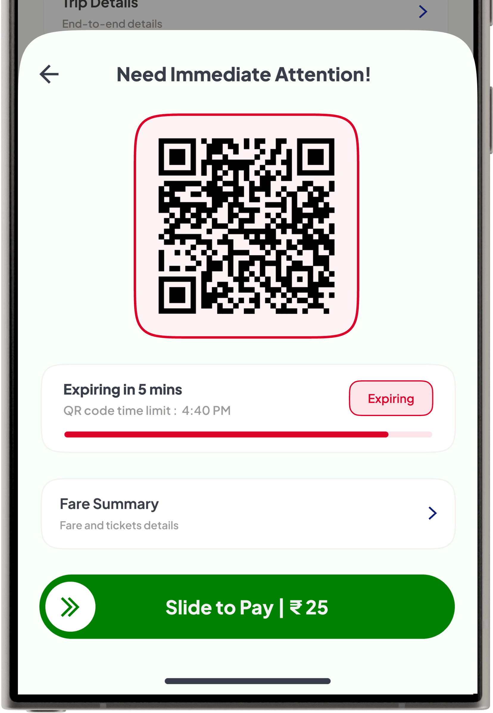
Expired QR Code
Problem:
Expired QR codes cause inconvenience, especially when users are unaware of ticket validity.
Solution:
Notify users a few minutes before expiry with an option to extend validity by paying a fee. Clearly display the extension cost and the new validity period to ensure transparency and seamless travel.
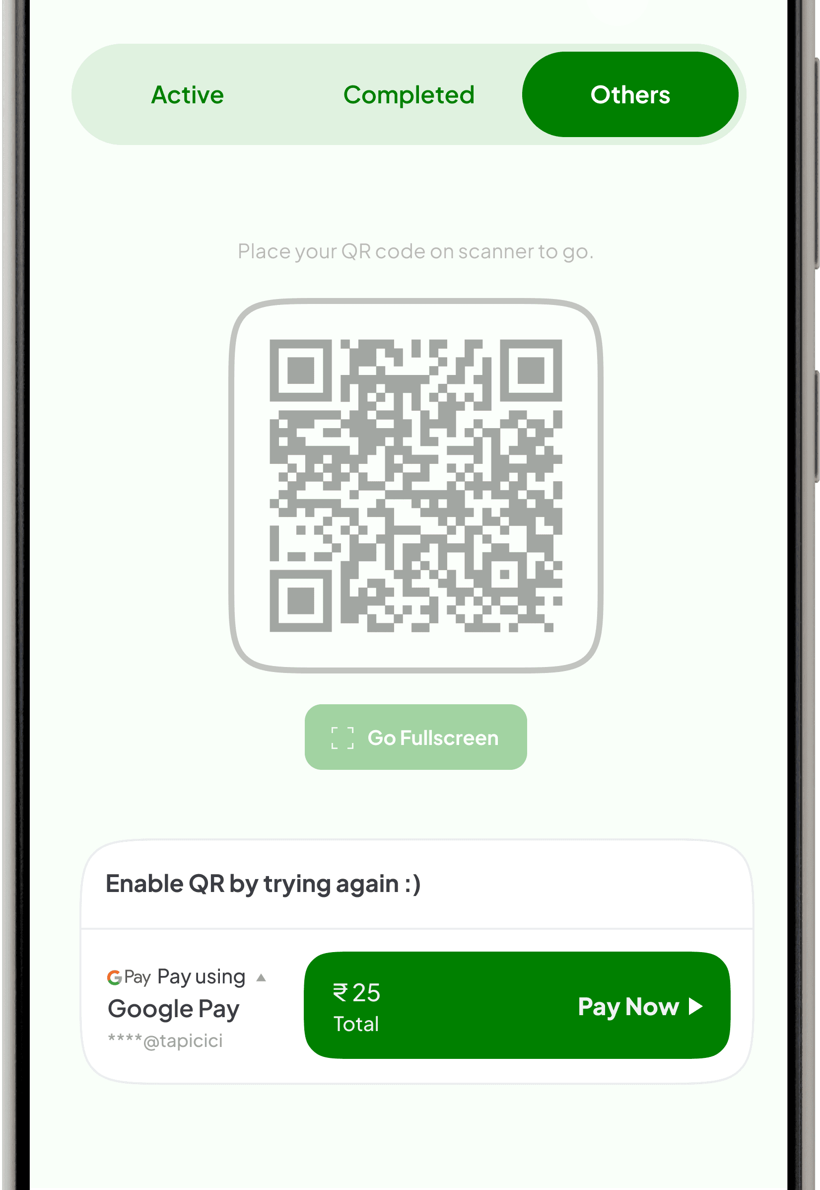
Payment Failure
Problem:
Users may encounter payment failures due to unforeseen issues, leading to frustration and delays in order processing.
Solution:
When payment fails, the app disables the QR code to prevent misuse and moves the ticket to the “Others” section. Users can retry payment with the option to change the payment mode, ensuring a secure and seamless resolution.
Where things go wrong : Edge cases
While the primary user flows ensure a seamless experience, handling edge cases is essential to creating a secure, reliable, and user-friendly product. These scenarios and their solutions highlight the robustness of the design and its ability to adapt to unforeseen situations.

Lost Connection
Problem:
Users may lose internet connectivity during their session, resulting in frustration and potential drop-offs.
Solution:
When users lose connectivity, the app displays a “Try Again” button paired with a trivia quiz, featuring a question stepper to track progress, creating an engaging, informative, and seamless recovery experience.
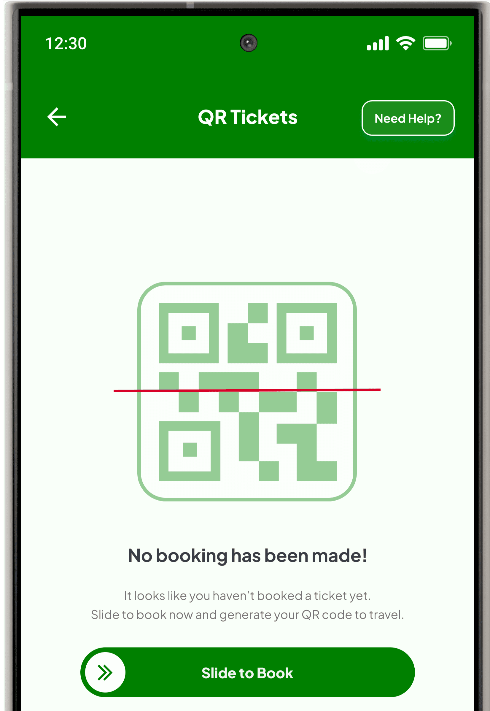
Empty State
Problem:
Users accessing the QR screen directly from the menu without booking a ticket may face confusion due to an empty state.
Solution:
The app displays a friendly message, “No booking has been made!” along with a visual placeholder of a QR code and a prominent call-to-action, “Slide to Book.” This guides users toward the next step, ensuring clarity and engagement.

Defining success metrics through (KPIs)
Tracking success is essential for validating a product’s effectiveness and ensuring it meets user and business goals. For this new product, where testing isn’t feasible yet, carefully defined KPIs (Key Performance Indicators) will act as benchmarks to evaluate its performance. These metrics are designed to capture user engagement, operational efficiency, and overall product impact—spanning from onboarding and user information intake to post-payment processes and dashboard interactions.
QR Ticket Success Rate
What to measure:
Track QR ticket booking, activation, and scanning success rates, ensuring smooth and efficient user journeys seamlessly.
How to measure:
Use Google Analytics to monitor bookings, activations, and scans. Analyze drop-off points and user behavior patterns to gain insights into potential friction within the process.
Traffic Update Engagement Rate
What to measure:
Track interactions with traffic updates, including clicks on heatmaps, traffic graphs, and saved route engagement.
How to measure:
Monitor user interactions with analytics tools. Track click-through rates and time spent to understand engagement patterns and identify areas needing improvement.
Payment Retry Analysis
What to measure:
Analyze retry success rates, resolution times, and user satisfaction when resolving failed payments effectively.
How to measure:
Monitor retry attempts and resolution times using analytics tools. Track user behavior comprehensively to identify patterns and assess the overall effectiveness of the retry process.
Live Updates Usage Analysis
What to measure:
Track visits to Live Updates and engagement with features like traffic graphs, saved routes, and people counts.
How to measure:
Monitor screen visits and feature engagement using analytics tools. Analyze user behavior patterns to understand interaction trends and overall impact on usability.
Empty State Conversion Rates
What to measure:
Measure user engagement with empty states, retrying payments, booking tickets, or interacting with calls-to-action.
How to measure:
Use analytics tools to track interaction rates with CTAs in empty states. Analyze trends comprehensively to understand user preferences and engagement effectively.
NPS (Net Promoter Score)
What to measure:
Track satisfaction levels and likelihood of users recommending the app based on overall features and usability.
How to measure:
Conduct periodic in-app surveys to collect feedback and Net Promoter Scores. Analyze results to understand user satisfaction and overall app performance.
© Copyright 2024. All rights Reserved by Jayant
Designed with love intent and crafted with purpose © 2025. All Rights Reserved by Jayant.