Notification Enablement
Initial Concept: Started with a minimal interface using basic text to prompt users to enable notifications. While functional, it lacked visual engagement and failed to communicate the value of notifications effectively.
Final Design: Refined with engaging visuals, a clearer heading, and actionable subtext to highlight the importance of real-time updates. Added permission prompts and secondary options like “Not Now” to emphasize user transparency and control.
Initial Concept
Final Design
Adds visual reinforcement to the concept of receiving notifications, improving engagement despite the minimal design.
Provides a secondary option for users to decline notifications, ensuring flexibility and maintaining a sense of control.
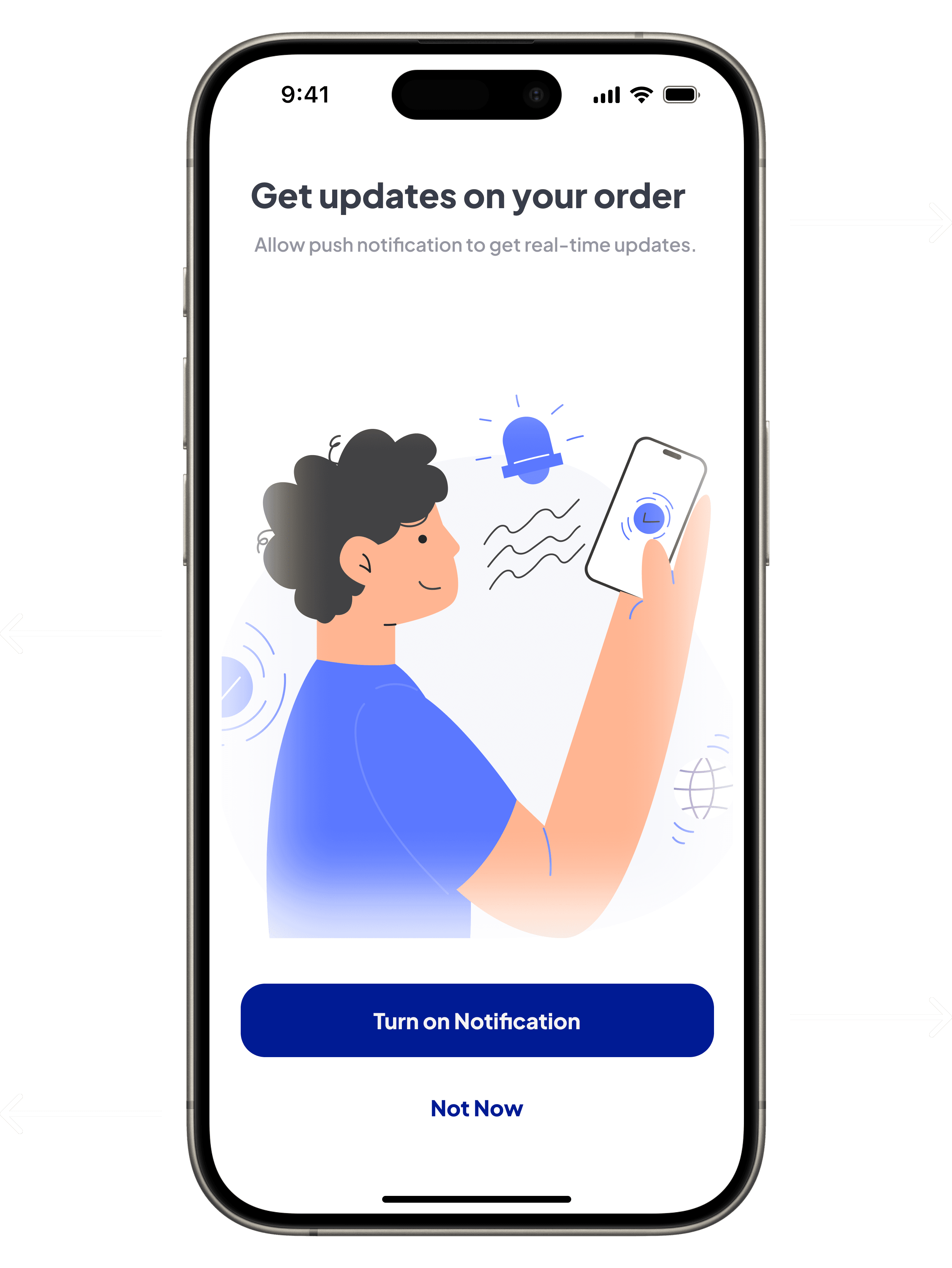
Primary call-to-action encourages users to turn on notification, strategically placed for easy thumb access.
Communicates the expanded scope of notifications beyond order status, with actionable subtext highlighting the importance of real-time updates and their user benefits.

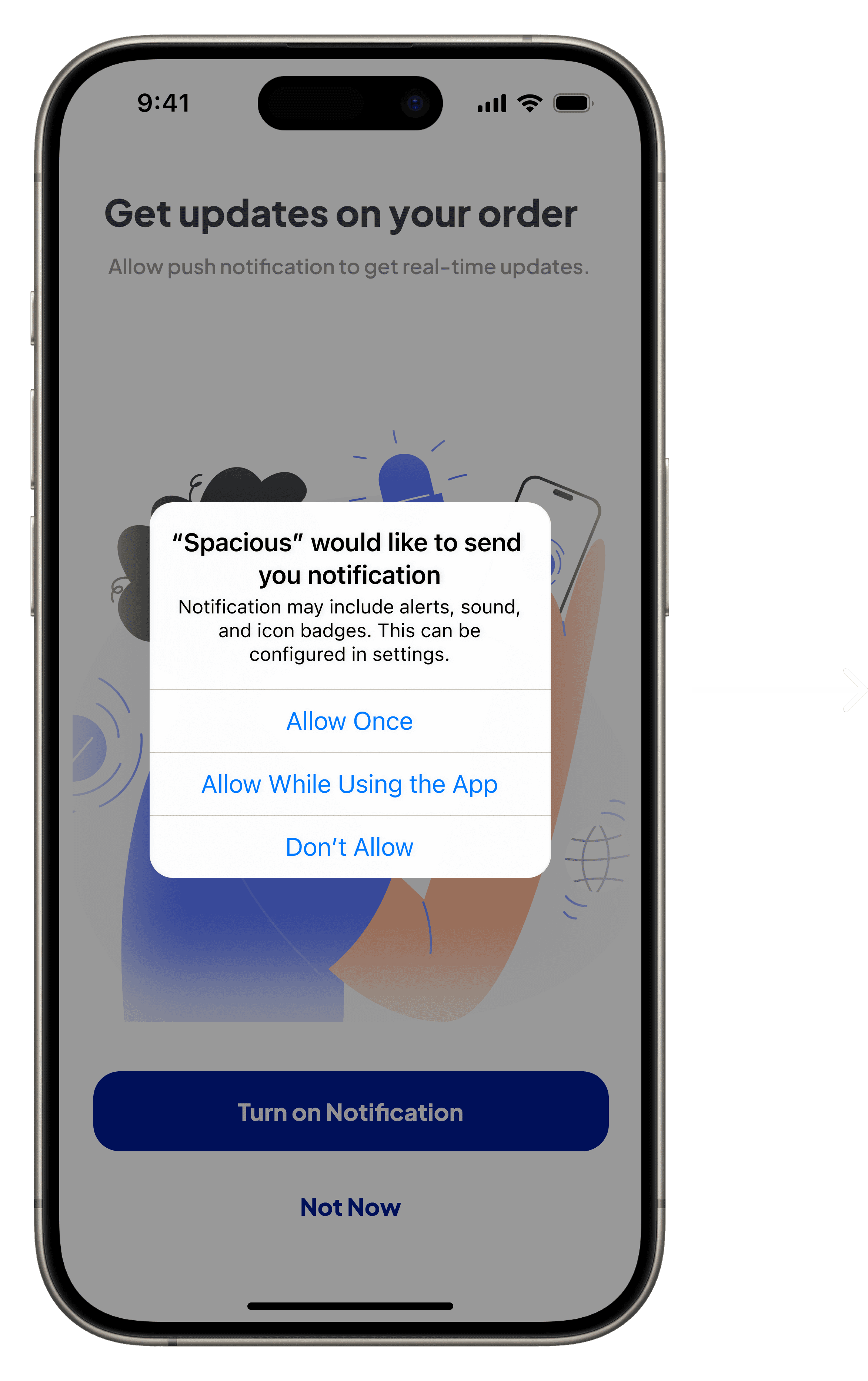
Introduces a permission prompt to ensure user privacy and transparency, giving users clear control over when and how notifications are enabled.

Wrapping it up : The Lessons!
Designing Spacious was an opportunity to tackle real-world challenges, blending user insights with thoughtful solutions to create a seamless storage experience. From addressing complex edge cases like unauthorized pickups and payment failures to ensuring clarity in user flows, every aspect was shaped with usability and scalability in mind.
This case study highlights not only the value of understanding user pain points but also the importance of designing solutions that can adapt to diverse contexts. The focus on accessibility, transparency, and trust demonstrates how design can impact everyday lives, offering convenience and peace of mind to users navigating transitional moments.
Beyond this project, these findings open up broader questions about how emerging technologies like AR and AI can further enhance similar experiences. The lessons here can inspire solutions for other industries where flexibility and user engagement are paramount.
I’d love to hear your thoughts—share your comments, ideas, or even critiques. Or, explore the next case study to see more examples of design in action.
Challenges? Definitely!
Balancing Research and Design Translation
Challenge - Research provided a strong collaborative foundation, but translating these insights into actionable designs presented several hurdles. The complexity lay in addressing layered user needs and product goals without losing focus on usability.
How I Overcame It - To ensure alignment, I kept the research findings readily accessible throughout the design process to stay grounded and avoid deviating or overcomplicating the flow. Prioritizing the major user flow, I simplified the core experience and deferred extra features as future enhancements. This approach enabled me to maintain a balance between usability and the MVP’s scope.
Addressing Edge Cases Thoughtfully
Challenge - Edge cases, while uncommon, have a significant impact on user experience and trust if not handled effectively. The real challenge lay in identifying potential edge scenarios early, ensuring they didn’t disrupt the primary user flow, and creating seamless solutions that addressed rare but critical problems without overcomplicating the design.
How I Overcame It - To tackle these, I proactively mapped user journeys and identified points where these edge cases could arise. While there could be many edge cases since user behaviors vary, I focused on the major ones where failures were most likely. This approach not only resolved potential issues but also maintained the overall simplicity and usability of the design, specifically addressing unauthorized pickups, connectivity issues, payment failures, and empty states.
Simplifying Complex Processes
Challenge - The major challenge was finding a way to optimize storage space, offer users flexibility on costs, and ensure the product itself remained efficient. Balancing the need for accurate item measurements with a simple and user-friendly process was particularly difficult,as overly complex features might risk alienating users, while overly simplified options could compromise efficiency and cost optimization.
How I Overcame It - To tackle this challenge, I focused on designing a system that balanced user convenience and product efficiency. Accurate measurement was key to optimizing storage space and reducing costs. To achieve this, I introduced AR measurement, enabling users to measure their items precisely and maximize space utilization. This also helped them determine suitable P2P or warehouse options, ultimately lowering costs for both users and the product. To make the process more inclusive, I provided options for manual measurements and predefined sizes, allowing flexibility for users who preferred simpler methods or were willing to pay slightly more for convenience.
Ensuring Transparency and Trust in the Post-Payment Journey
Challenge - Post-payment features needed to be carefully designed to provide users with transparency and a sense of security—an area where many solutions fail, especially when personal items are involved. Users are naturally concerned about the safety and handling of their belongings, which made it essential to ensure consistent communication and trust across this critical stage of the journey.
How I Overcame It - To address this, I relied on user research to understand transparency gaps and user concerns. I carefully designed post-payment features like an arrival tracker and a checklist option with OTP verification to ensure the right delivery agent handles the items. While the process is largely automated post-payment, these interactive features involve the user, making them an active participant in ensuring their items’ safety. Additionally, I implemented clear tagging and storage workflows, providing real-time updates from pickup to storage, all of which are accessible on the user’s dashboard for a seamless and transparent experience.
Future directions : Expanding possibilities
As the product evolves, several opportunities arise to enhance its functionality and user experience. These future directions focus on addressing operational challenges, improving user engagement, and expanding the scope of the platform to cater to broader use cases. By implementing these improvements, the product can ensure scalability, efficiency, and a more refined experience for all stakeholders.
Expanded Edge Case Handling
Tackle additional edge cases like operational delays, availability mismatches, and emergency scheduling issues.
Delivery and Pickup Experience
Create separate apps or workflows for drivers, owners, and warehouses to streamline operations and communication.
Cost-Saving Self Drop-Off
Enable users to reduce logistics costs by independently delivering items to designated storage locations for added convenience.
KPI-Driven Enhancements
Utilize insights from KPIs to refine workflows and features, driving continuous improvement and optimizations.
Personalized Scheduling by AI
Use predictive algorithms to suggest optimized storage and retrieval schedules based on user patterns and preferences.
Enhanced Retrieval Process
Streamline the retrieval process by integrating advanced scheduling option with better real-time tracking.
Where things go wrong : Edge cases
While the primary user flows ensure a seamless experience, handling edge cases is essential to creating a secure, reliable, and user-friendly product. These scenarios and their solutions highlight the robustness of the design and its ability to adapt to unforeseen situations.
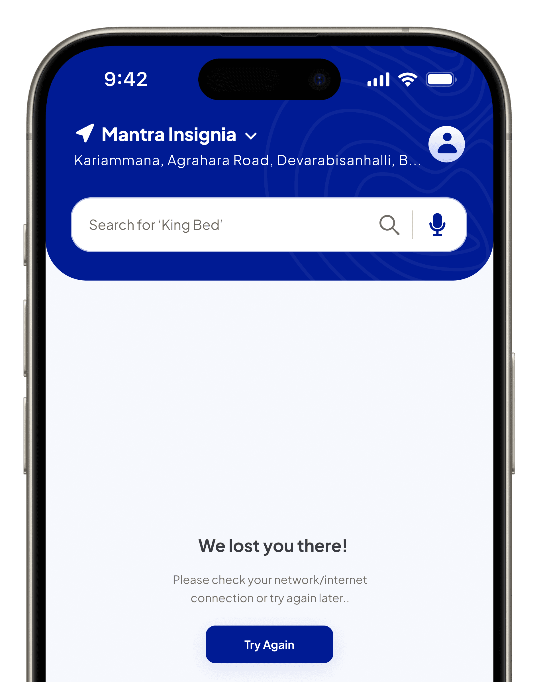
Lost Connection
Problem:
Users may lose internet connectivity during their session, resulting in frustration and potential drop-offs.
Solution:
When users lose connectivity, the app displays an error screen with a try again button and gamification, keeping users engaged and transforming downtime into a fun and interactive experience.
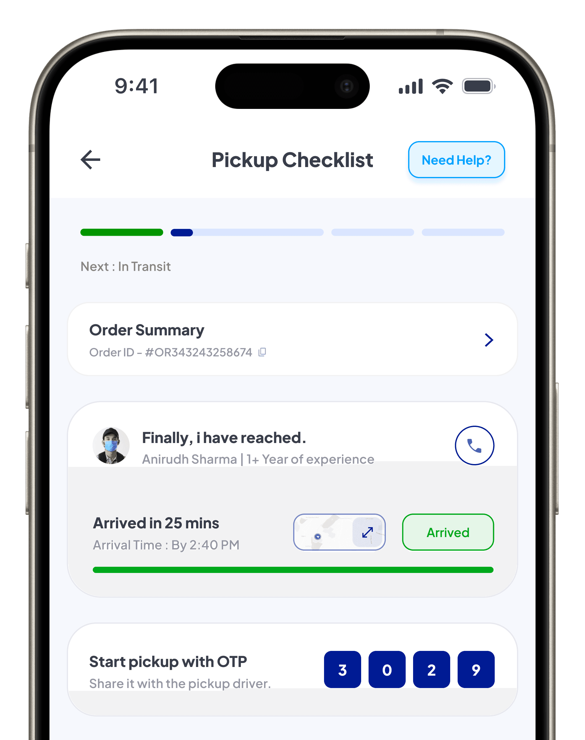
Unauthorized Pickup
Problem:
The person initiating the pickup process might not match the registered account holder, leading to potential security risks.
Solution:
When the pickup driver arrives, an OTP will appear on the Pickup Checklist screen for the user to share with the driver. Upon verification, the checklist will unlock dynamically; otherwise, the system will halt the process, ensuring security.

Empty State
Problem:
Users may face an empty state on the dashboard without items, causing confusion and disengagement.
Solution:
When users encounter an empty state, the app displays a friendly message and call-to-action. For example, first-time users accessing the dashboard without data see a prompt, making the screen purposeful.
Payment Failure
Problem:
Users may encounter payment failures due to unforeseen issues, leading to frustration and delays in order processing.
Solution:
When payment fails, the app encourages users to complete the transaction on the “Arriving” screen with the flexibility to change the payment mode, ensuring the booking remains active and avoiding unnecessary steps.

Dashboard
Initial Concept: The dashboard initially featured a static design with basic quick-access tiles and minimal visual feedback. This limited user engagement and made it challenging for users to navigate or understand dynamic updates, resulting in an underwhelming experience.
Final Design: The redesigned dashboard integrates real-time updates and intuitive grouping, supported by color-coded visual elements to enhance clarity and user interaction. It includes personalized greetings and better organization, making navigation seamless while improving efficiency for storage-related tasks.
Initial Concept
Final Design

Visually redesigned header with a personalized message, weather updates, and notifications, offering a quick overview and a welcoming experience post-storage process.
Flood Control Report provides details on preventive measures.
Pest Control Report provides details on maintenance updates.
Storage Details provides an overview of stored items and their current condition.
Provides video call functionality with clearly displayed owner availability, building assurance.
Retrieval option with a yellow tag showing the next available date, enabling effective planning.

Allow users to quickly check storage type details and associated information quickly.
Offers photo request functionality with displayed owner availability, ensuring a quick turnaround,
Provides a clear timeline of upcoming maintenance tasks.
Fire Safety Report (disabled) provides details on inspections.
Security Check Report provides updates on recent audits.
Allows users to track historical updates on inventory activities.
Storage Plan offers information on the current plan and allows user control.
Payment option in red highlights
due amounts, ensuring timely action.
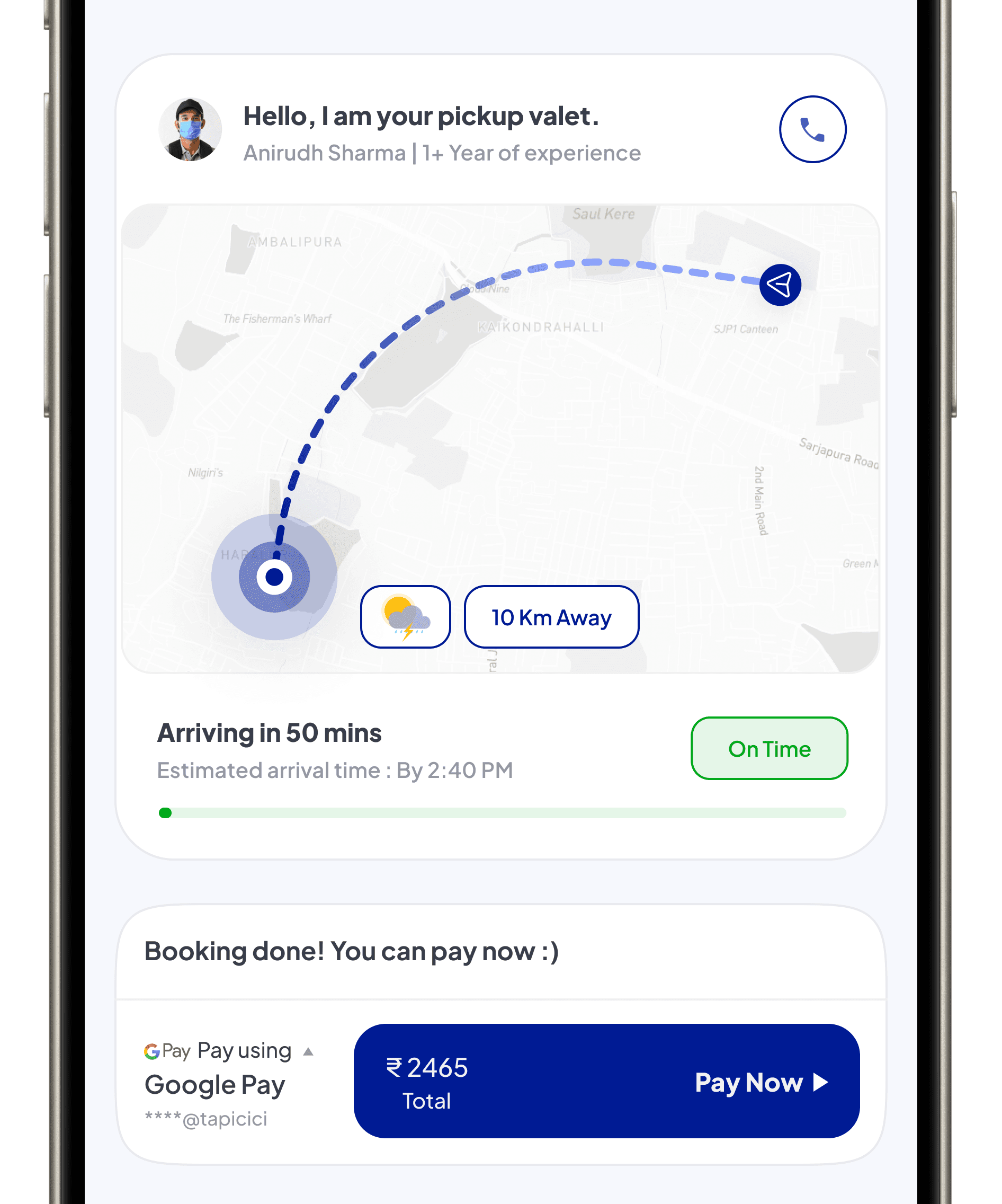
Post Payment
Initial Concept: Provided a static and less interactive interface, focusing on minimal automated updates for post-payment tasks. The process lacked user engagement and sufficient support for handling edge cases, leaving gaps in transparency and assistance during
critical post-payment scenarios.
Final Design: Redesigned to address user engagement and edge case scenarios, enhancing the post-payment process with real-time updates, transparency in order details, and seamless access to support. The improved flow ensures a more interactive and empowering experience, reducing friction and anxiety for users.
Initial Concept
Final Design
Allow users to address issues immediately, improving the experience for edge cases.
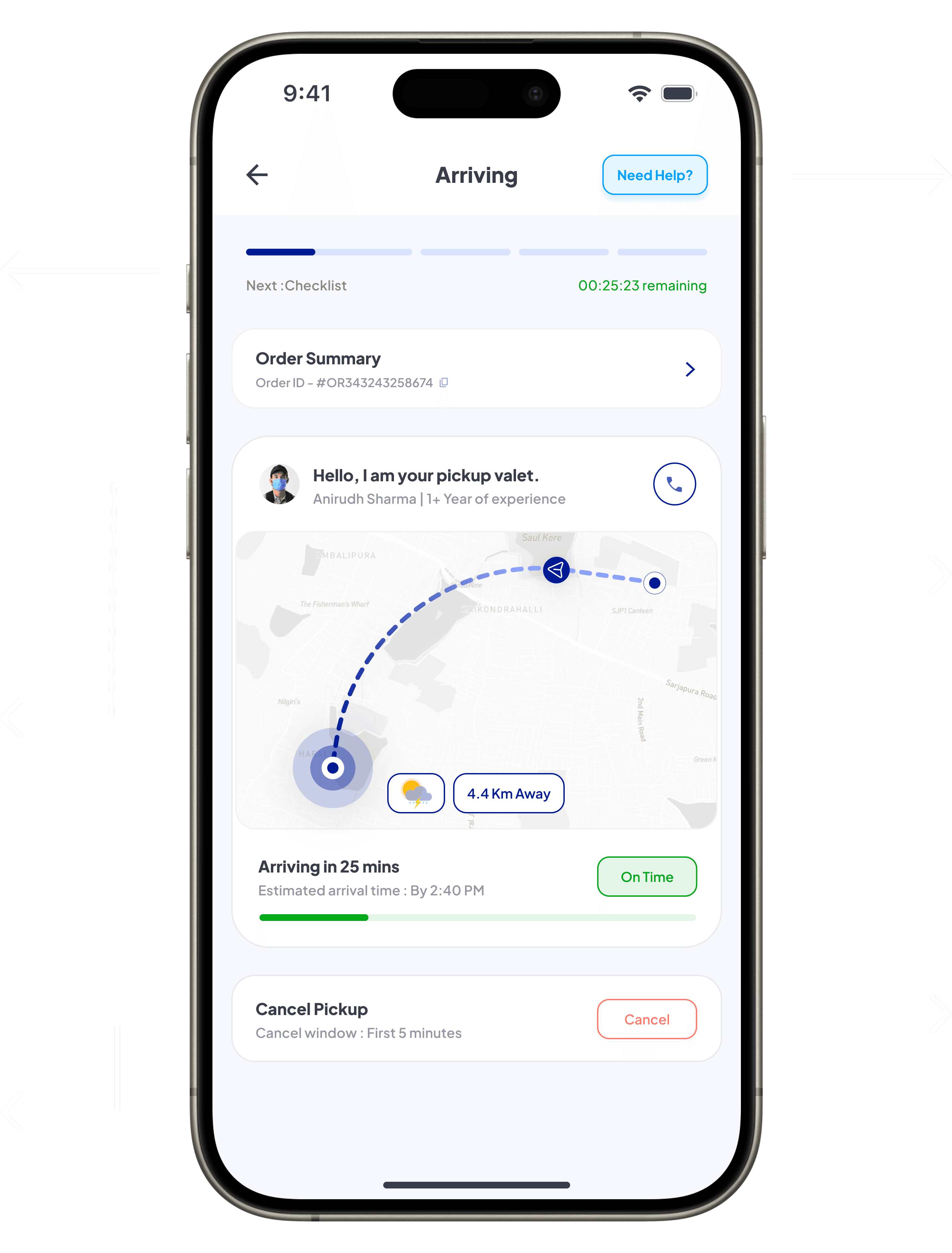
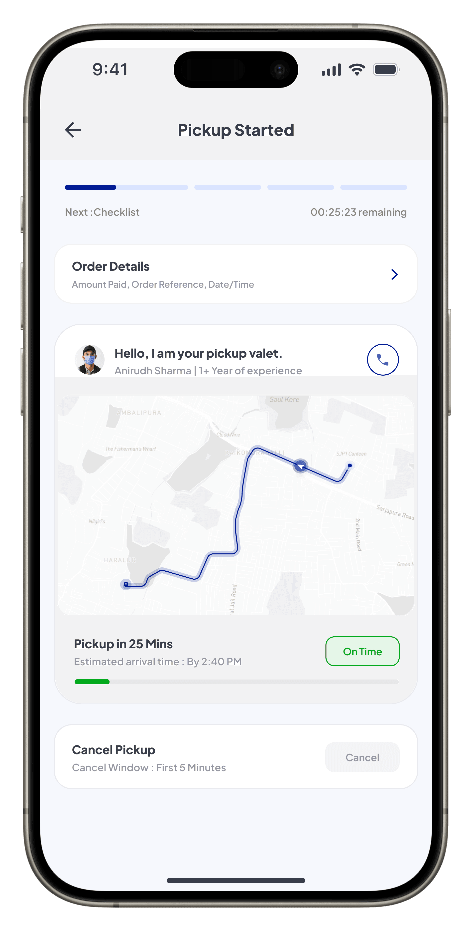
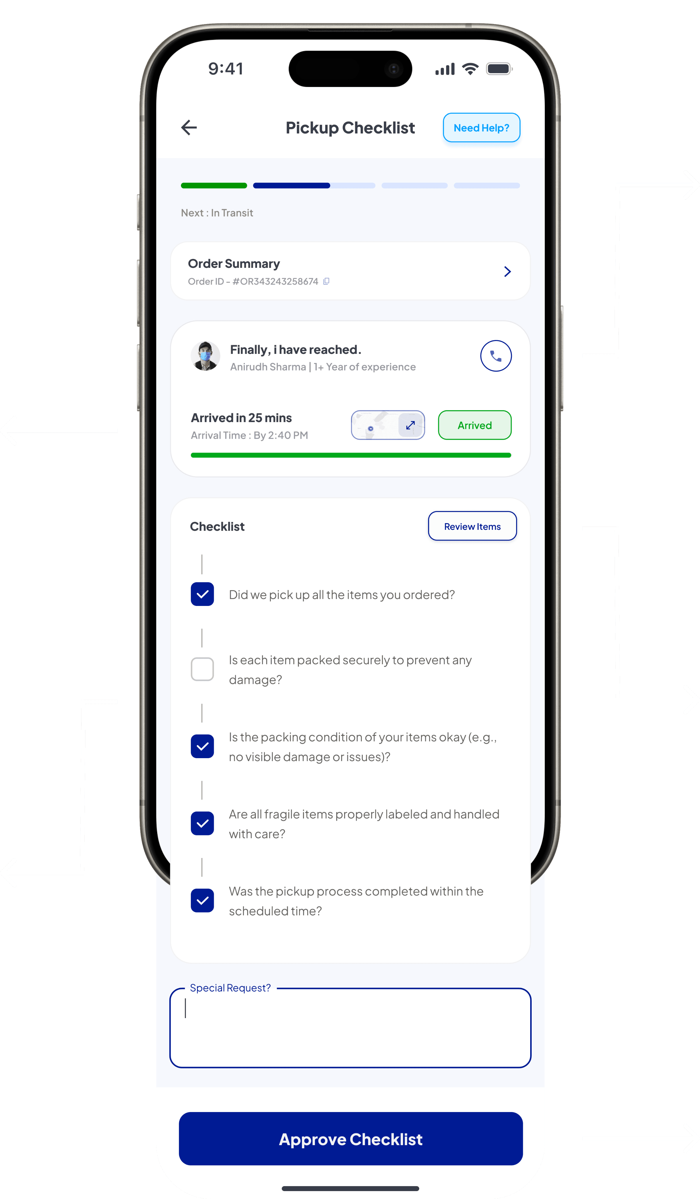
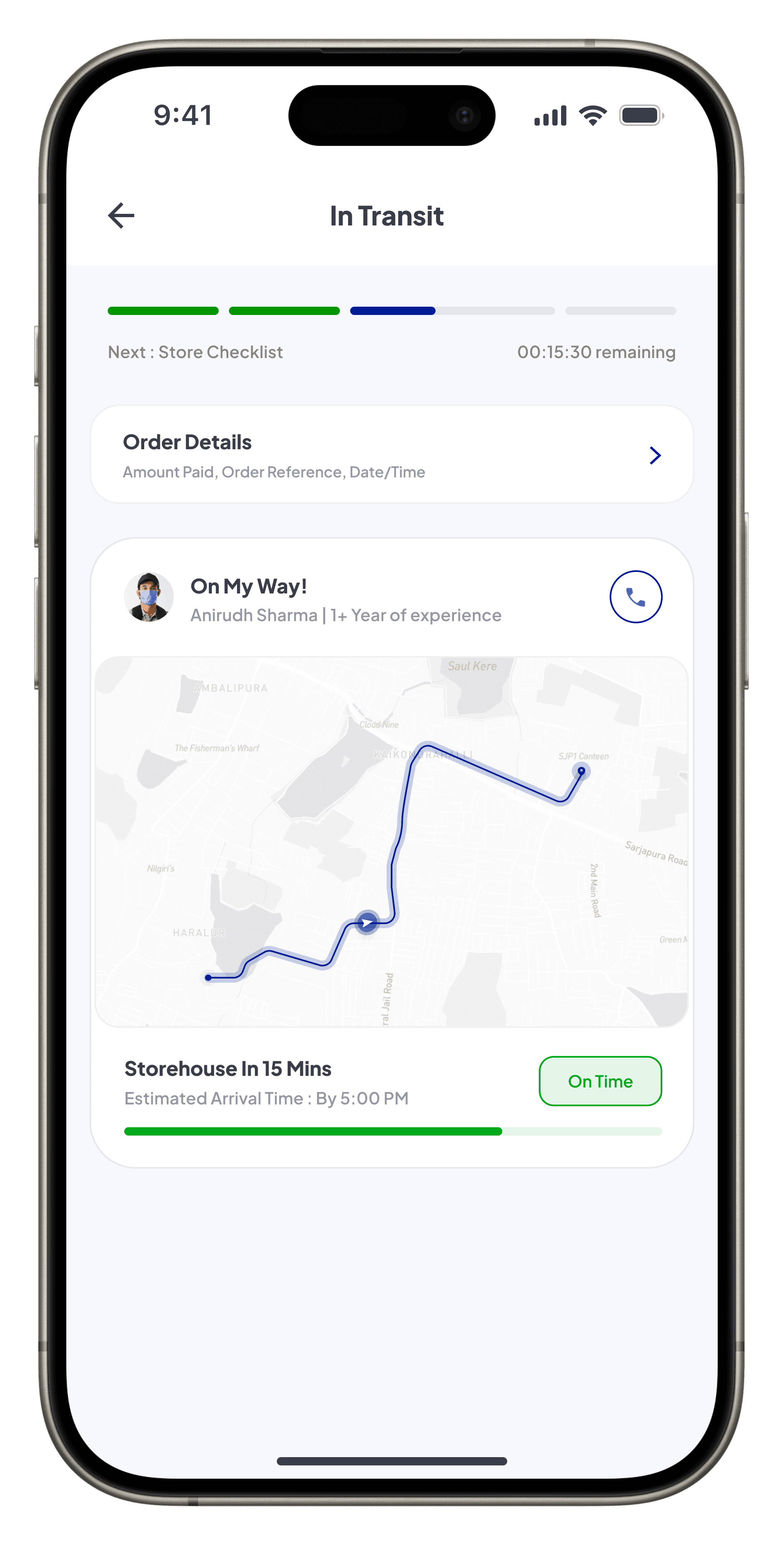
Highlights the stepper with next-step guidance (“Next: Checklist”) and remaining time, ensuring users have clarity on where they are in the process and what comes next.
Offers a quick overview of order details with a copy-to-clipboard icon for seamless access, enabling users to resolve any issues.
Highlights driver details with a friendly message and years of work experience for relevance, along with a call option to coordinate address or resolve edge cases efficiently.
Improved map visuals for clearer destination and pickup spotting, enhancing arrival time estimation, with added details like distance left and weather conditions for full transparency.
Enables users to cancel the pickup within a defined window (First 5 Minutes), ensuring flexibility while maintaining service integrity.

Provides driver details along
with a phone number for direct communication, enabling users to handle edge case queries.
Driver’s arrival details, along with
a collapsible/expandable map
to track the current status and coordinate effectively.
Allows users to quickly review items being packed, making the process transparent and user-centric by providing a final confirmation of all packed items.
Step-by-step checklist for users to validate packing, ensuring all items are securely handled and accounted for during the process, reinforcing user involvement.
Empowers users to approve the checklist after verifying items are securely packed, ensuring a smooth transition and trust.

Provides real-time updates on the driver’s status and current journey to the storehouse, accompanied by a friendly message to keep users informed and reassured.
Displays real-time driver
location on an improved map interface, showing the driver’s route with a distance metric and estimated arrival time.
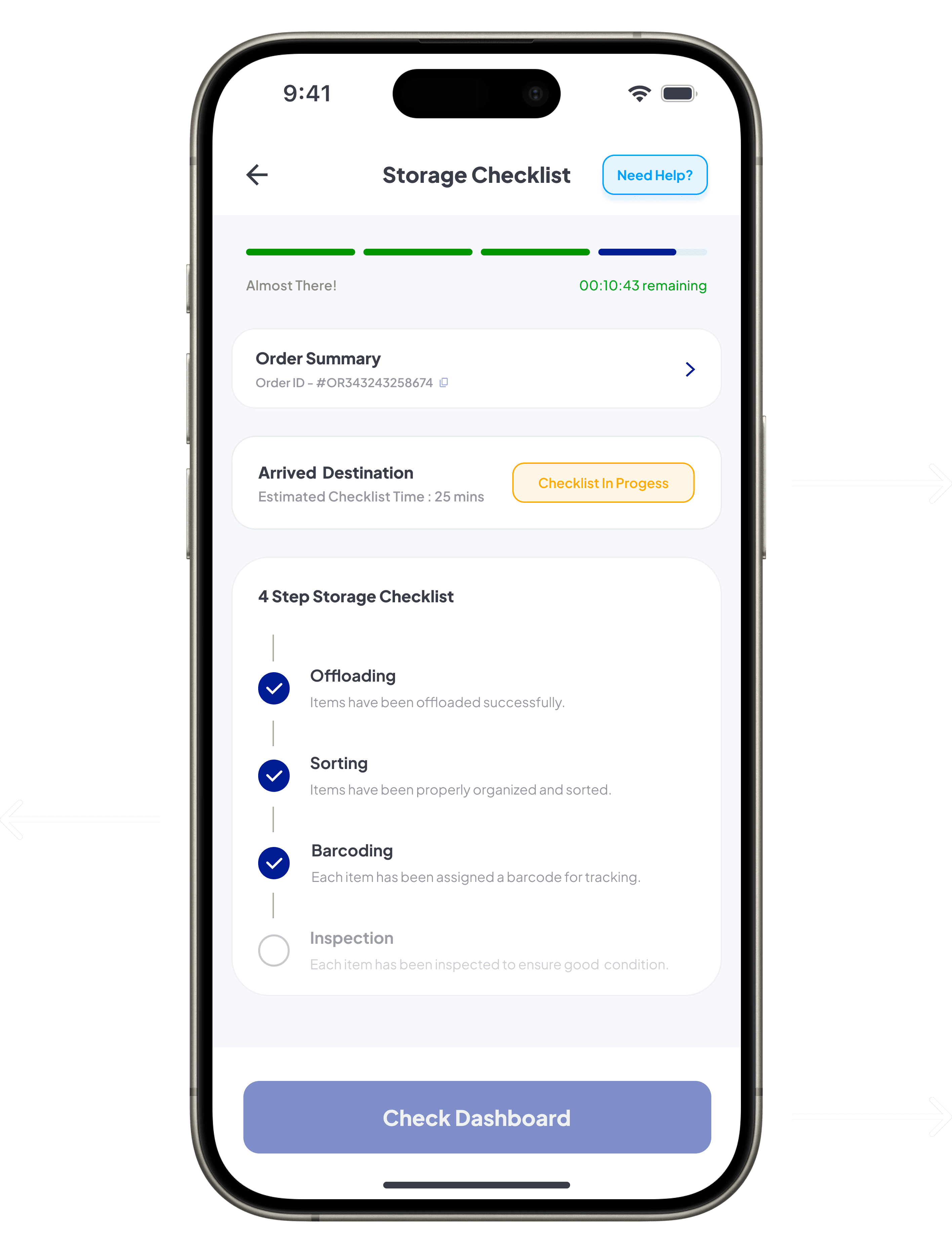
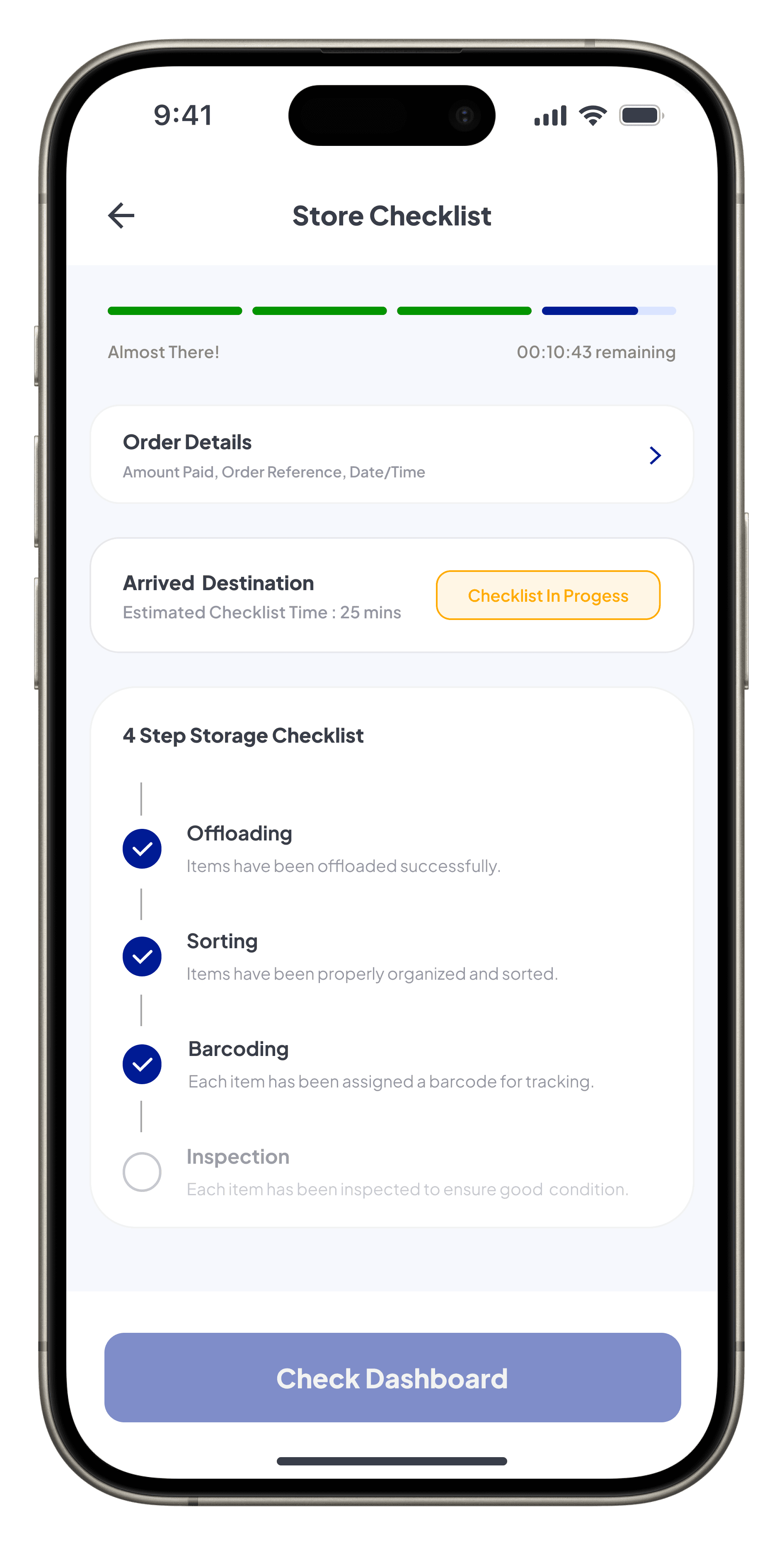
Provides a quick overview of the order details and auto “Check-in Progress” status, keeping users informed about the current stage and estimated time to complete.
Highlights the 4-step automated process conducted at the storage facility, visually guiding users through each stage and ensuring transparency in the workflow.
Remains disabled until the automated process is complete, ensuring users proceed only when relevant actions are available.


Highlights the final status, indicating that all processes are successfully completed with a timestamp, offering users a clear understanding of task completion and transparency.
Indicates the final status with a “Checklist Completed” tag and the completed time, providing users with clear confirmation of process.
With all steps marked completed, visually reinforcing transparency and ensuring trust in the process.
Directs users to the dashboard for a detailed view of stored items and their status, ensuring smooth navigation and enabling further actions with ease.
Order and Payment Summary
Initial Concept: Relied on a basic and functional design for order summary and payment options. The process lacked visual clarity, contextual guidance, and enhancements that could simplify decision-making, making the flow feel disconnected and less intuitive.
Final Design: Refined into a cohesive and visually engaging experience, emphasizing clear navigation, transparency, and assurance in user actions. Improvements in structure and layout ensure a seamless flow, fostering confidence and simplifying the overall process.
Initial Concept
Final Design


Highlights the added ability to edit the pickup location, enabling users to correct errors or adjust preferences seamlessly while providing clarity on expectations.
Indicates the pickup timing, providing users with a clear understanding of the waiting period and ensuring better planning.
Offering users a quick, detailed overview of their order with expand-and-collapse functionality. Restricts item deduction to maintain cost estimation accuracy.
Allowing users to verify all selections made during the process ensuring a streamlined and informed checkout experience.
Redesigned with add and remove functionality, enabling users to unlock discounts and maximize savings directly, making the process more functional and efficient without additional layers.
Highlighting the importance of protecting personal belongings against unforeseen events, enhancing the app’s trustworthiness and assurance.
Offers users a transparent view of all charges, including storage fees, coupon discounts, and insurance costs, ensuring clarity.
Draws attention to the primary call-to-action, labeled as “Select Payment,” encouraging users to proceed seamlessly to the payment screen.
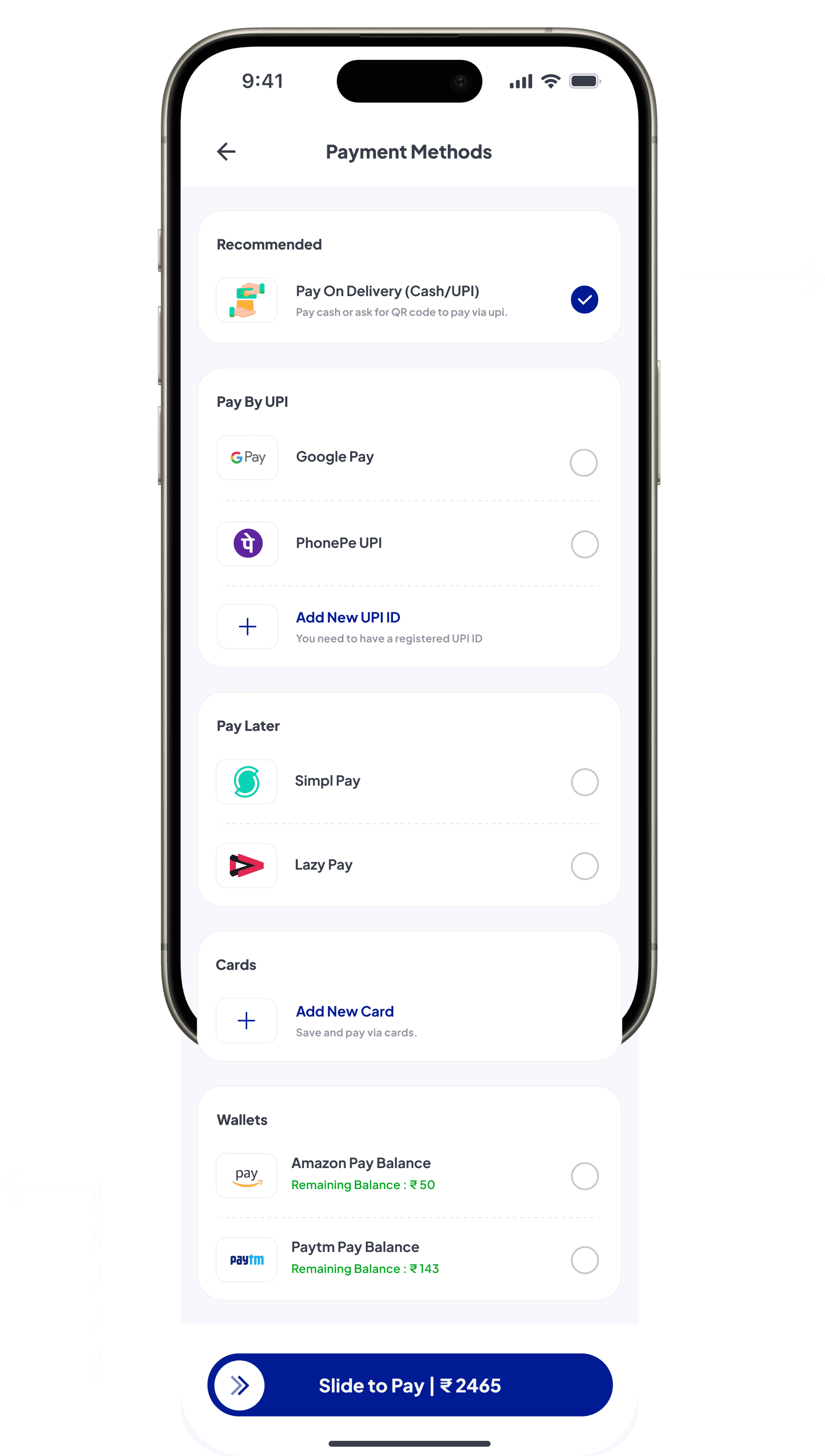

Guiding first-time users towards a reliable and familiar method like Cash/UPI until trust in the app is established.
Emphasizes the “Slide to Pay” interaction with total payable value, ensuring smooth, intuitive, and secure completion of the transaction process.
User Details
Initial Concept
Final Design
Updated “User Information” heading broadens the scope of collected details, offering more inclusivity and clarity.
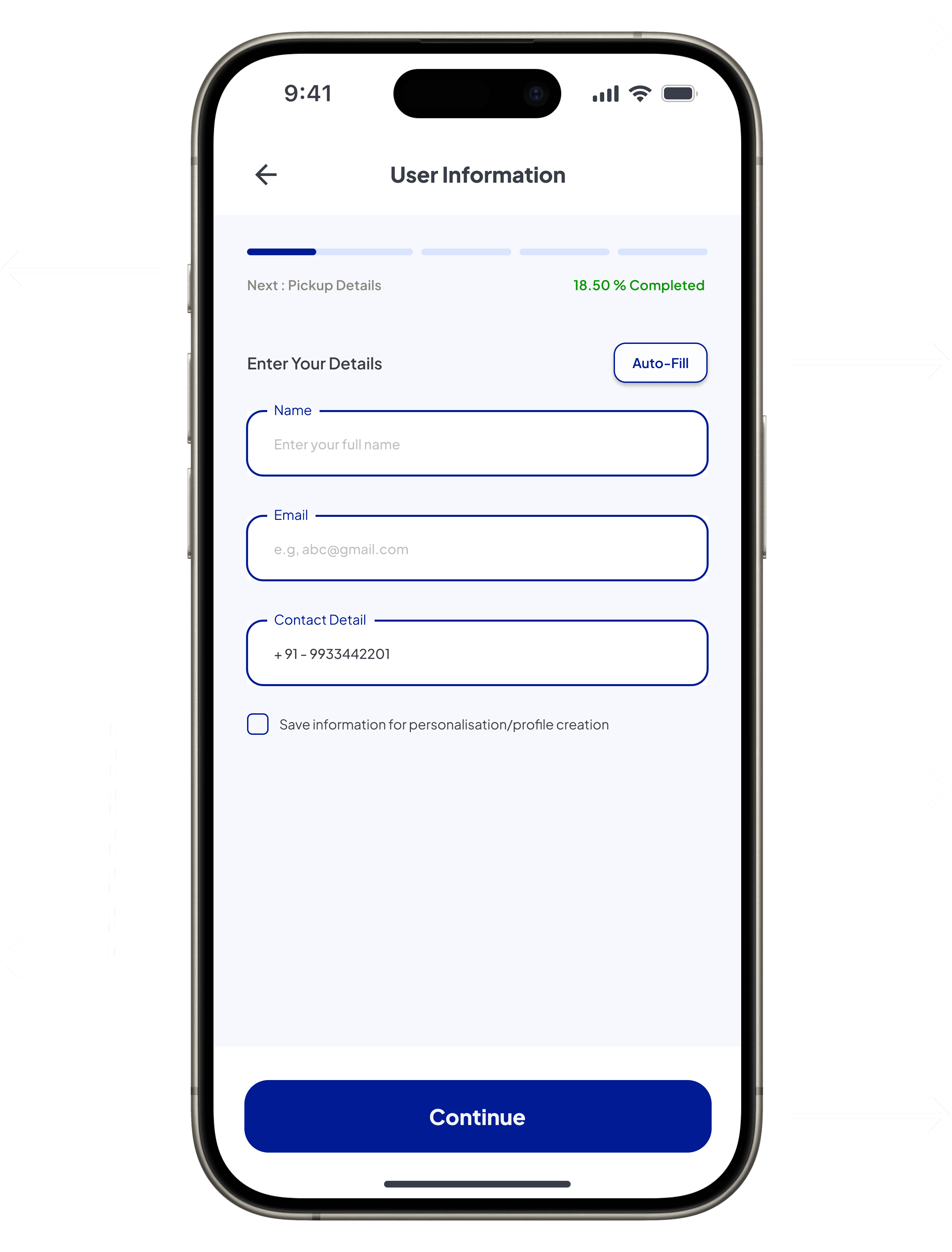
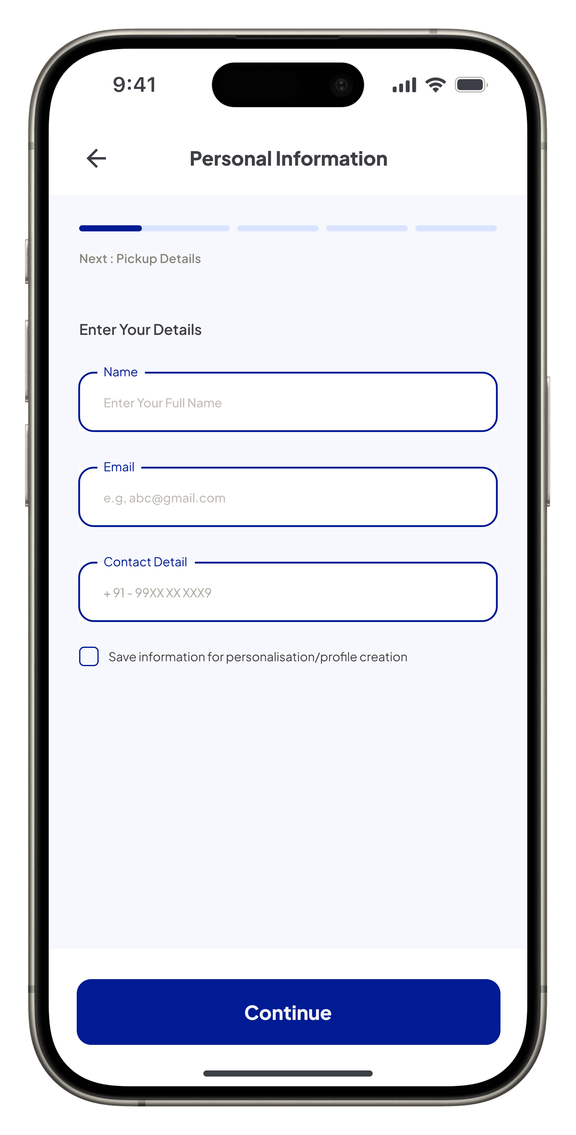
Draws attention to the auto-fill feature, allowing users to quickly populate fields, reducing manual effort and saving time.
The pre-filled phone number ensures consistency with onboarding data, eliminating redundant input steps.
The checkbox allows users to save information for personalization or auto-profile creation, enhancing future interactions.
Focuses on the primary call-to-action, positioned for easy accessibility. This ensures a smooth transition to the next step, maintaining flow continuity.
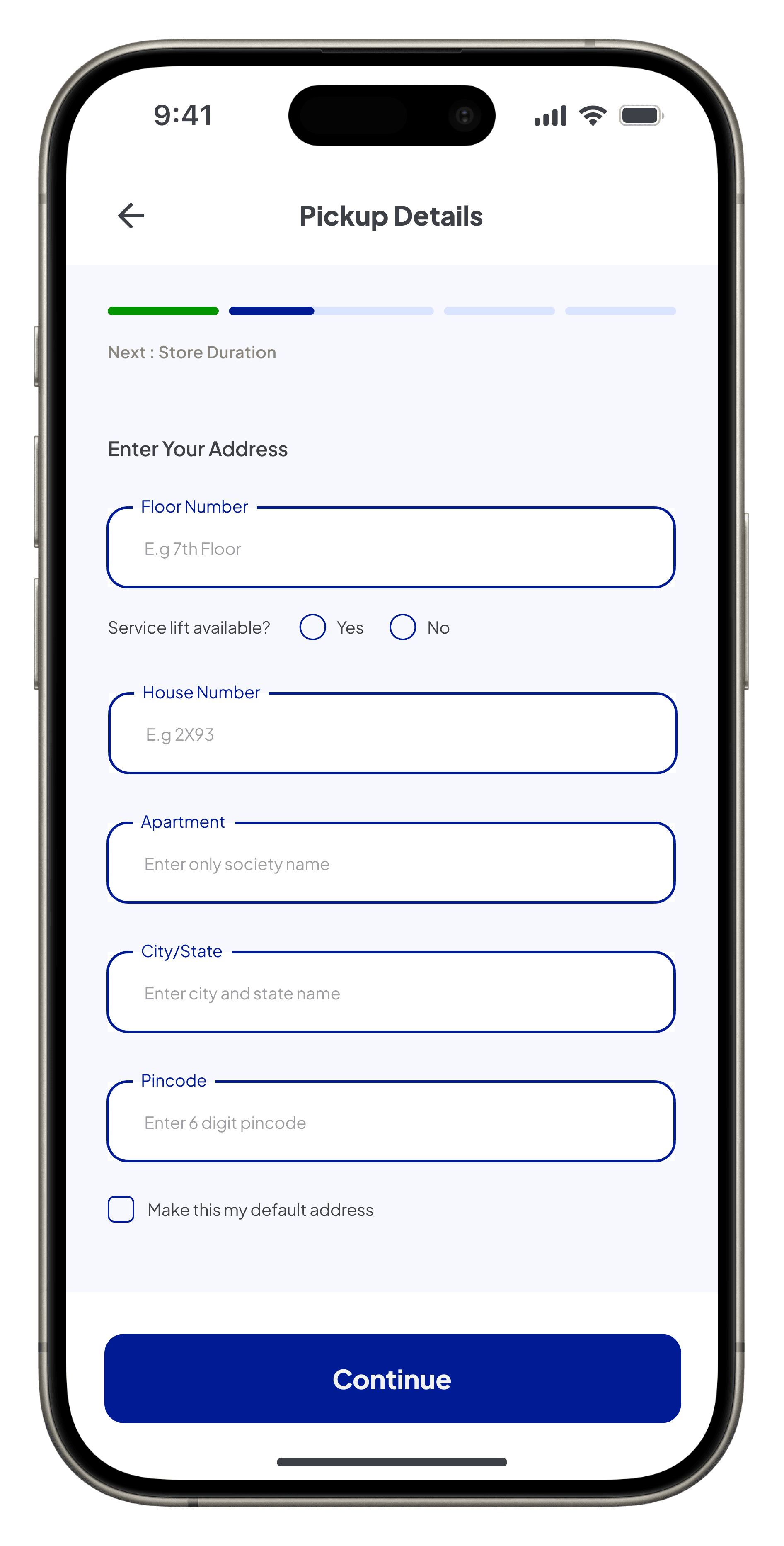
Updated “Pickup Address”, ensuring clarity about the task and aligning with the flow’s objective of step-by-step address entry.
Highlights the stepper with a completed steps in green and in-progress steps in blue for clear task visibility and seamless navigation.
“Service Lift Available” option, allowing users to specify accessibility preferences, ensuring better service customization.
Enabling users to save the entered address for future use, streamlining subsequent interactions and improving convenience.

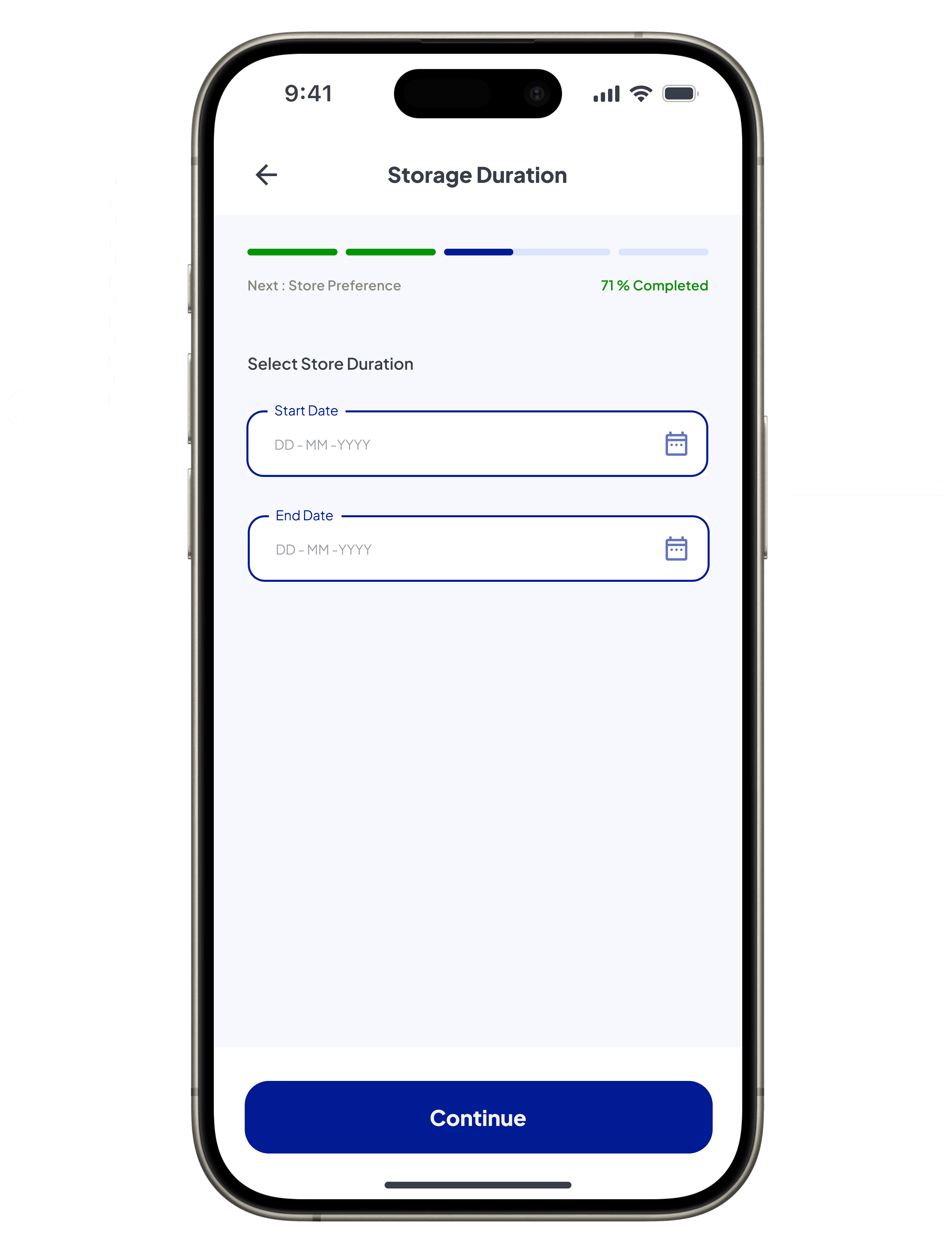
Updated “Storage Duration”, ensuring clarity about the task while aligning with the sequential flow of selecting rental details.
Focuses on the “Start Date” and “End Date” fields, allowing users to define the storage duration and enabling accurate rental cost calculation.

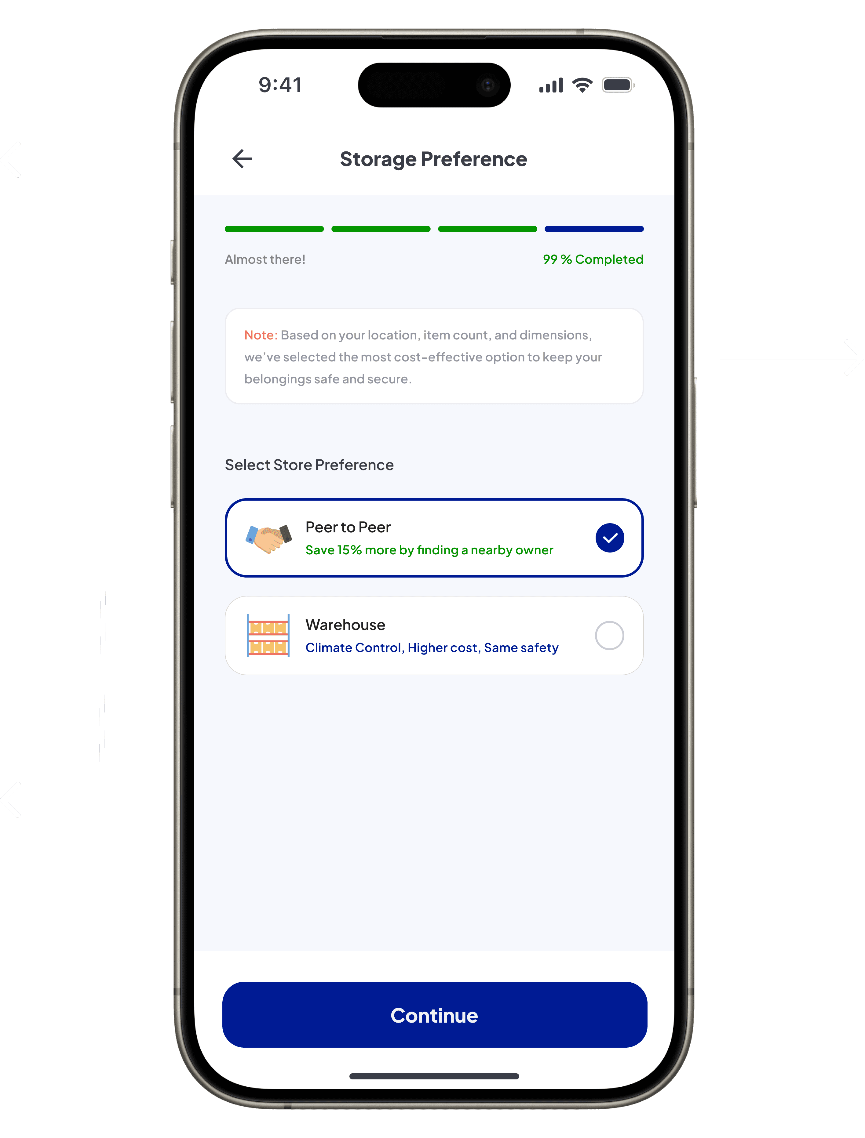
Updated “Storage Preference”, providing clarity about the selection task and aligning with the progress flow to maintain user understanding.
Draws attention to the primary call-to-action, ensuring users can seamlessly proceed to the next step with clear navigation and consistent placement.
Focuses on the selection options that cater to diverse user needs—highlighting cost-saving benefits for budget-conscious users and premium features like climate control for those prioritizing quality over cost.

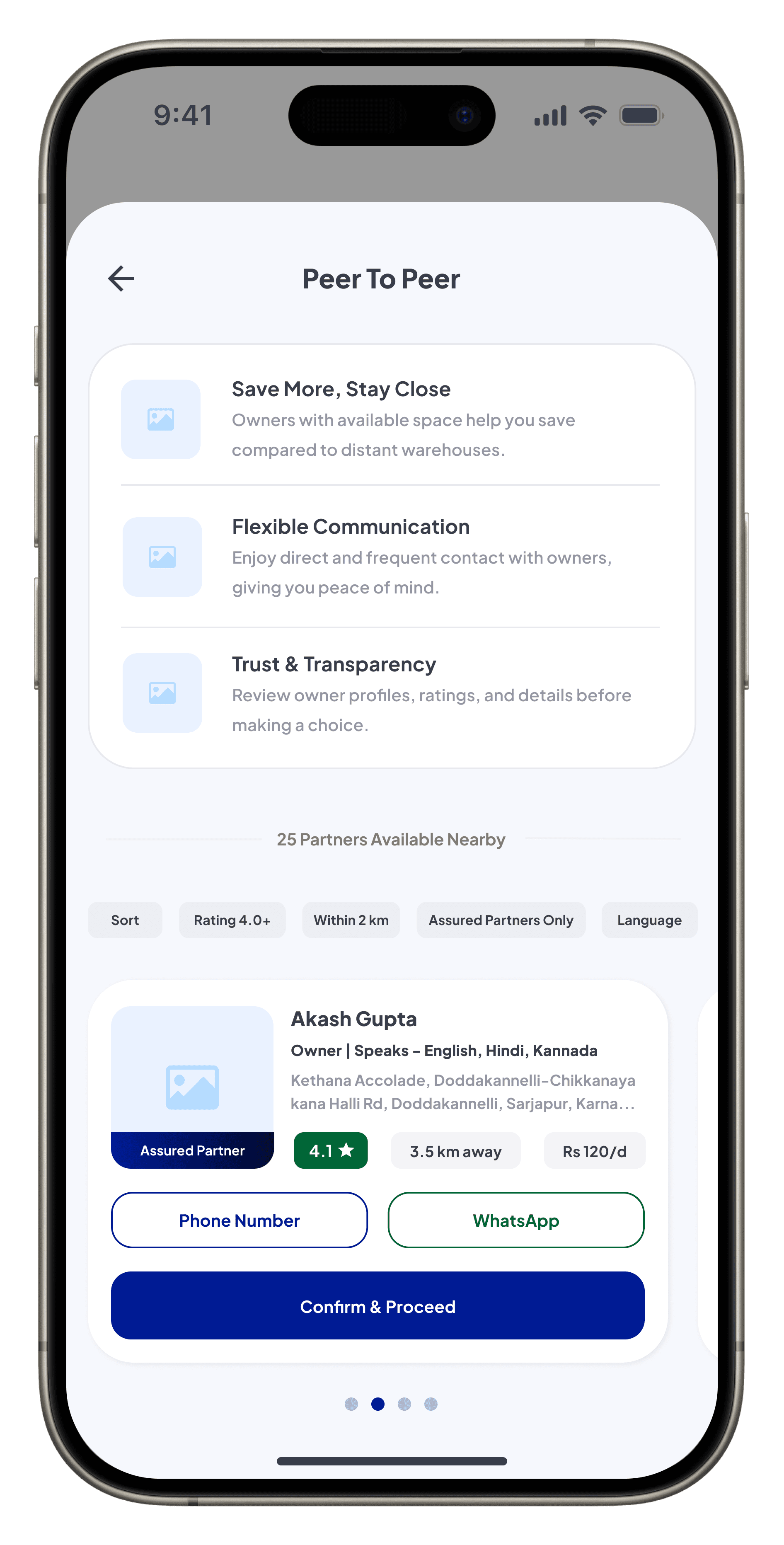
The pop-up heading emphasizes personalized and nearby storage options, catering to users who prefer localized and cost-effective solutions.
Highlights key features using visual icons and descriptions to build user trust and simplify decision-making.
Highlights the owner profile section, displaying details like ratings, distance, pricing, and contact options offering users transparent and actionable information for decision-making.
Focuses on filters such as Sort, Rating, Distance, Assured Partners, and Language, enabling users to refine their search for storage providers based on preferences and priorities.
Points to the primary call-to-action, ensuring users can confirm their selection and seamlessly proceed to the next step.
Highlights the progress indicator with task completion percentage and contextual next-step text, providing real-time feedback to guide users through the flow seamlessly.

Initial Concept: The first iteration followed a step-by-step linear flow to collect user details, pickup information, storage duration, and preferences. While functional, the process felt manual and repetitive, offering limited visual hierarchy and engagement, making it less intuitive and time-consuming.
Final Design: The refined design improves the linear flow by enhancing visual clarity, providing task-focused segmentation, and ensuring a smoother experience. Updates like clearer decision-making cues and improved structure reduce user effort and build confidence throughout the process.
Add and Review Items
Initial Concept: A basic flow for adding items focused on functionality but lacked clarity in measurement methods and organization, offering limited visibility into grouped categories or total item counts.
Final Design: Redesigned for a clearer user journey, with intuitive grouping, structured item reviews, and real-time adjustments. Add screens highlight measurement methods, while review screens emphasize organization and efficiency, ensuring a seamless experience.
Initial Concept
Final Design

Highlights how manually updated dimensions provide measurement flexibility while maintaining clarity through consistent visual feedback.
Emphasizes the + and - structure for real-time quantity adjustments, enabling quick interactions and ensuring seamless task completion.
Reinforces measurement accuracy with the updated green dimension label, ensuring clarity and trust in AR or manual methods.
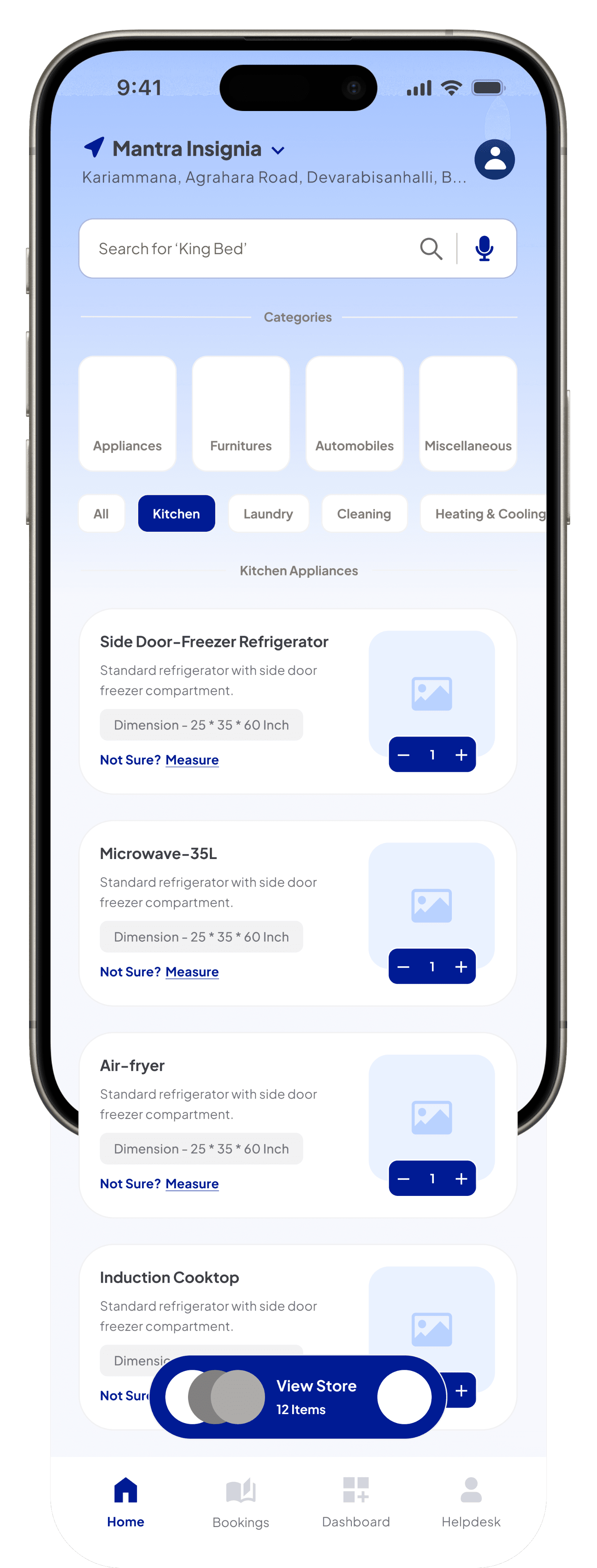
Directs focus to the floating “View Store” button, displaying the total item count for quick cart access while preserving a clean interface.


Highlights the category grouping and item count within each category, allowing users to quickly review the structure of their selections, ensuring better overview and organization.
Showcases the expandable card layout for sub-categories, units, and quantities, ensuring compact organization and clear item grouping.
Draws attention to the “Missed Something? Add More Items” link, providing users with an option to revisit the selection process and ensuring flexibility in updating cart.
Emphasizes the “Continue” button, guiding users to the next step with a clear progression and seamless navigation for task completion.
Measure via AR
Initial Concept
Final Design

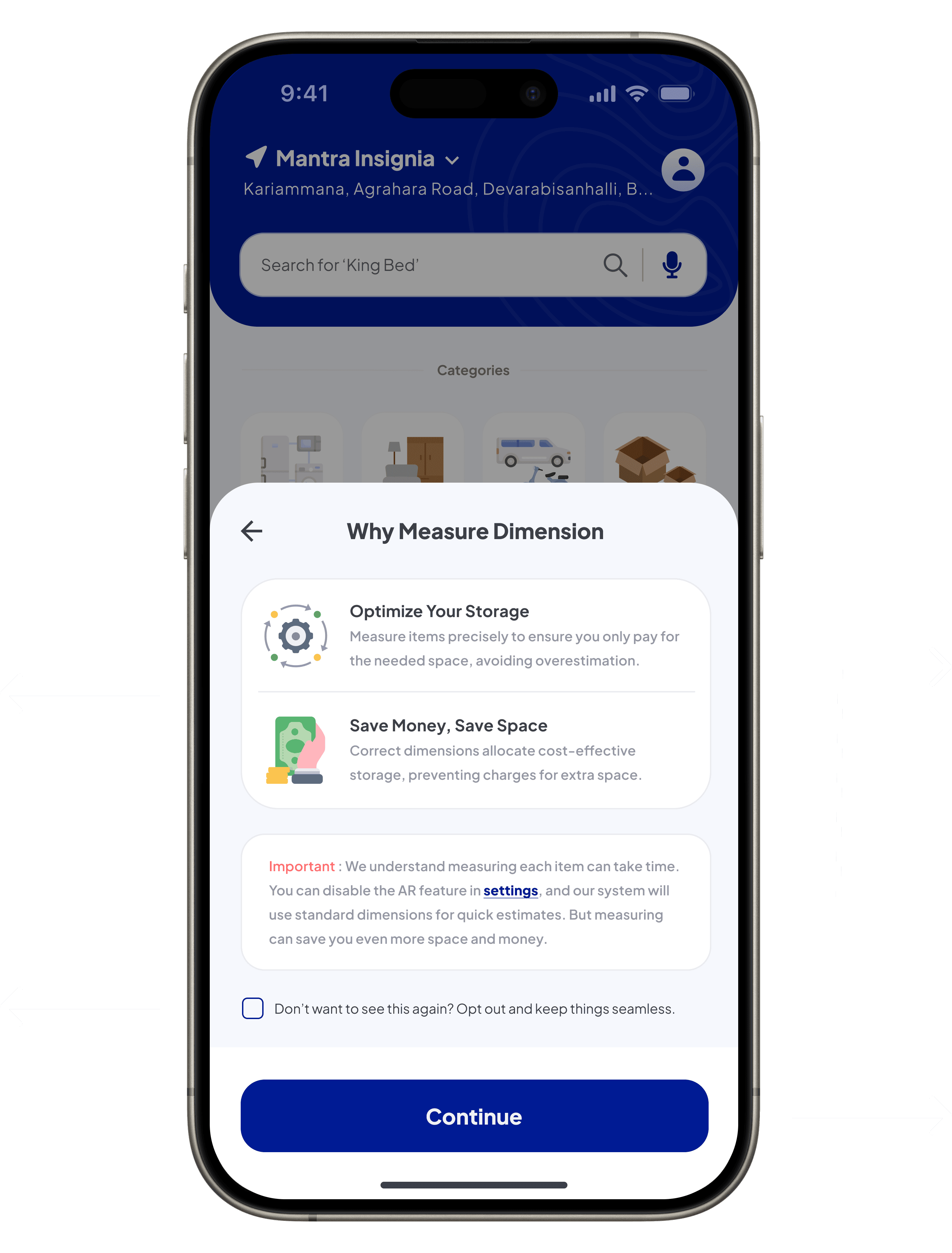
Positioned with a red accent to improve visibility and reassure users about time concerns, building trust and reducing hesitation.
Highlights key benefits like cost savings and storage optimization, encouraging users to understand the value of measuring dimensions early on.
Provides an option to skip steps, ensuring efficiency for repeat users while maintaining benefits for first-timers.
Designed for thumb reachability, the bold button ensures seamless navigation to the next step.
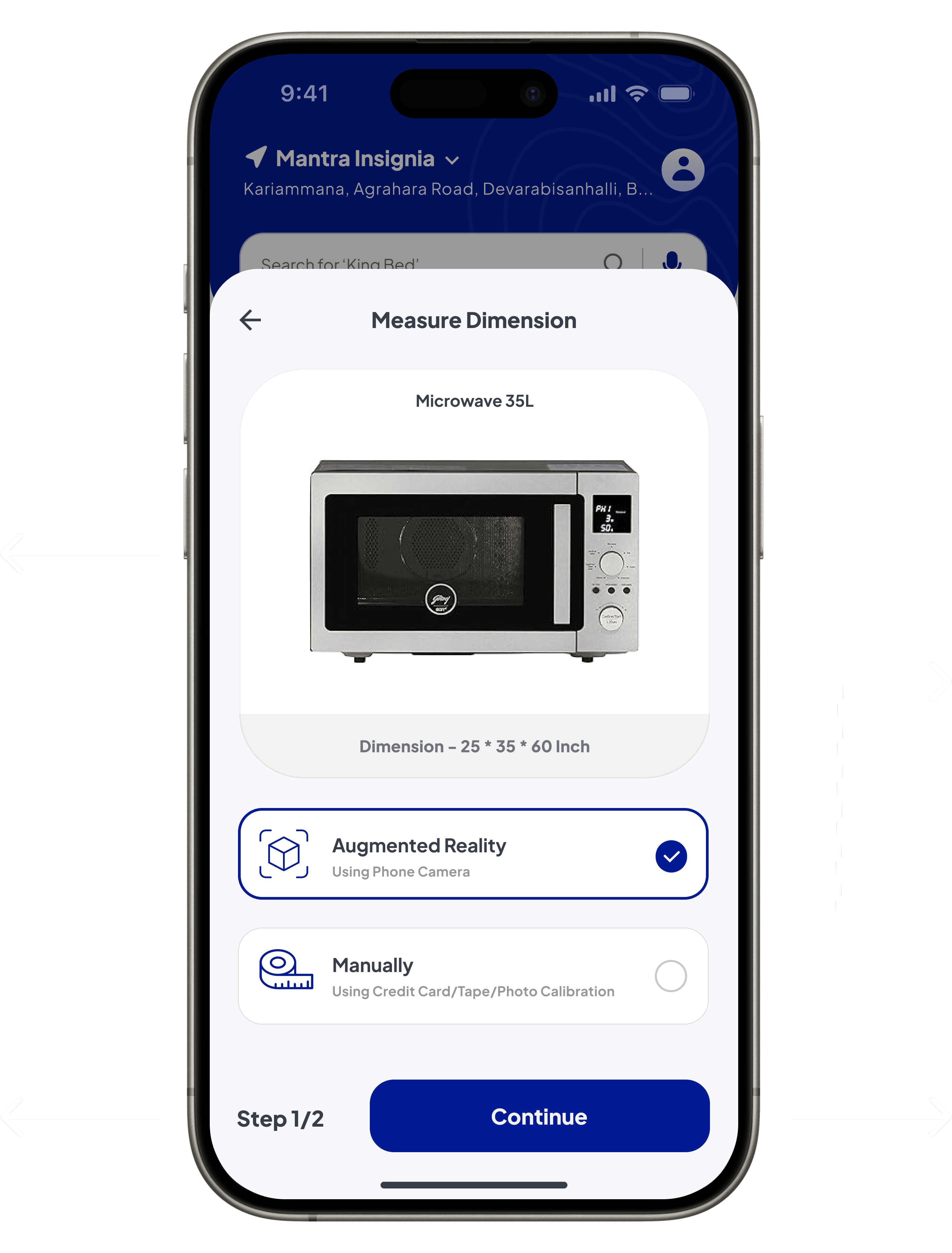
Clearly indicates the purpose of this screen, helping users focus on evaluating dimensions before making a decision. It ensures clarity and confidence in the process.
Offers two distinct options, “Augmented Reality” and “Manual,” with clear icons and descriptions. This enhances usability by catering to diverse user preferences and technical accessibility.
Provides a progress indicator, informing users about the number of steps involved, reducing cognitive load and ensuring transparency.
Positioned prominently, the primary button maintains workflow continuity, guiding users smoothly to the next step.

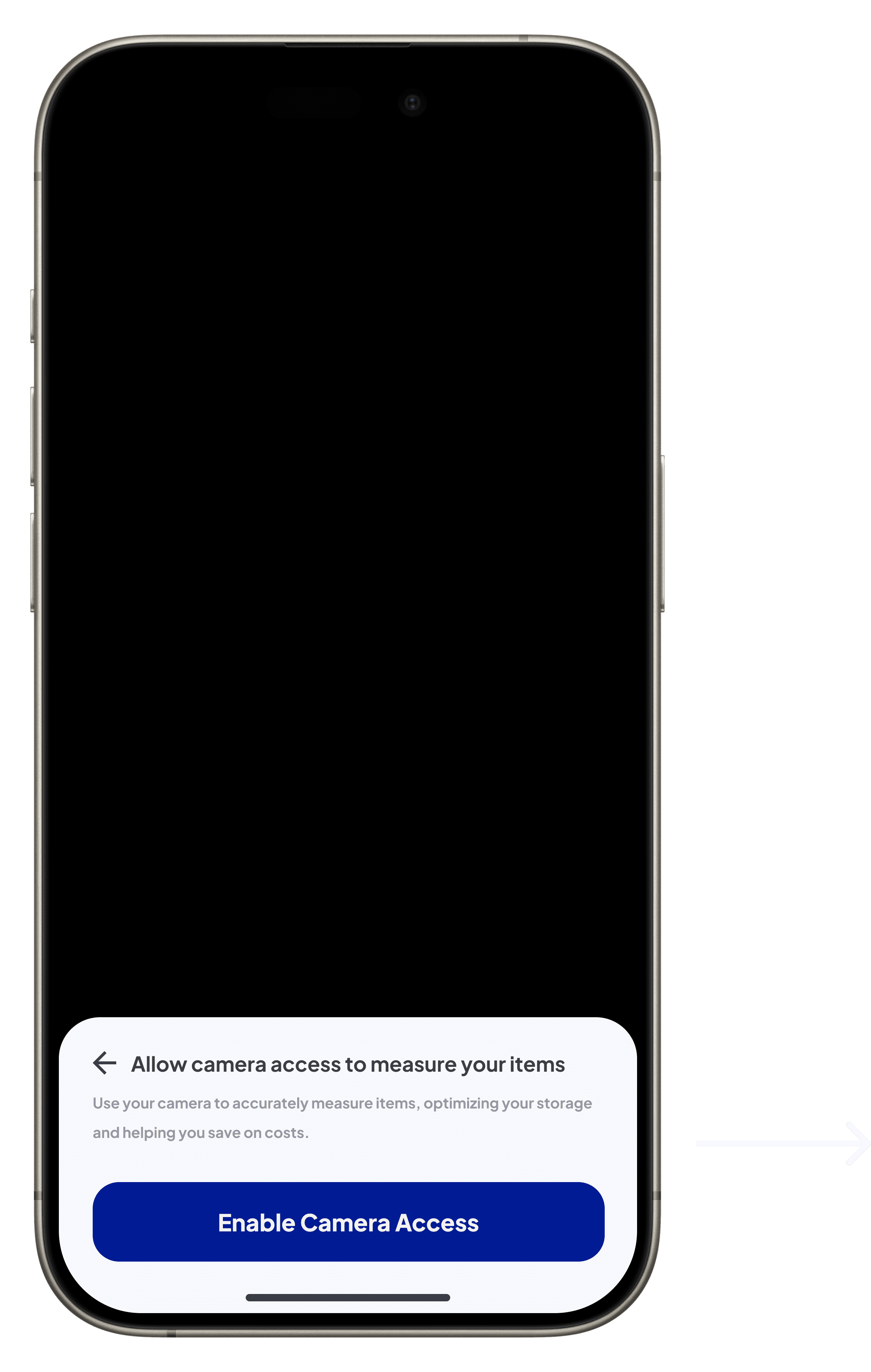
Guides users to grant camera permissions, a necessary step for using the AR feature. The clear and prominent call-to-action ensures seamless progression and reduces friction for first-time users.
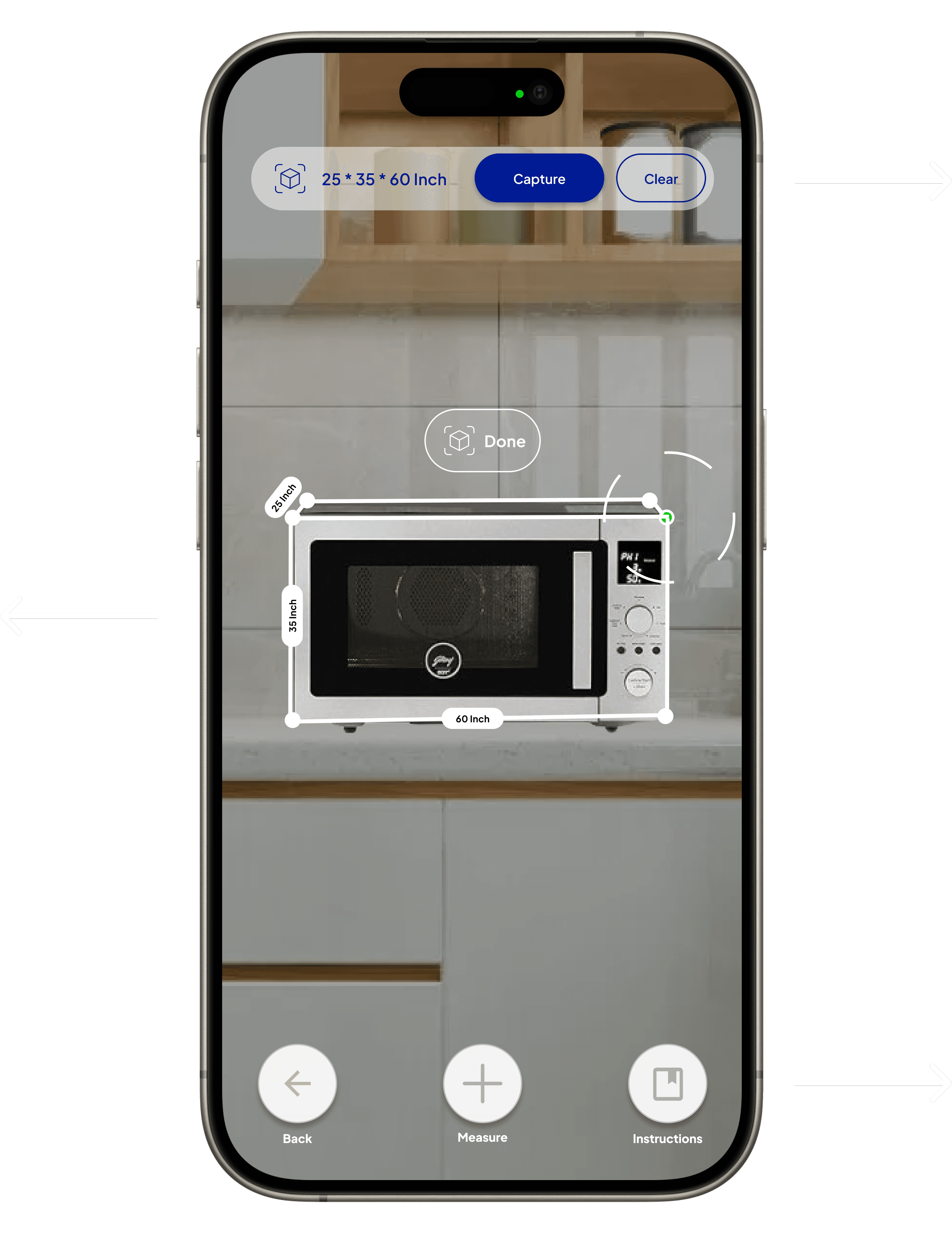
Allows users to interactively adjust the product’s AR dimensions, ensuring precision and enabling them to visualize the best fit before finalizing.
Allows users to interactively adjust the product’s AR dimensions, ensuring precision and enabling them to visualize the best fit before finalizing.
Features options like Back, Measure, and Instructions, providing users with the tools needed for guidance, accurate adjustments, and ensuring they have full control over the AR experience.
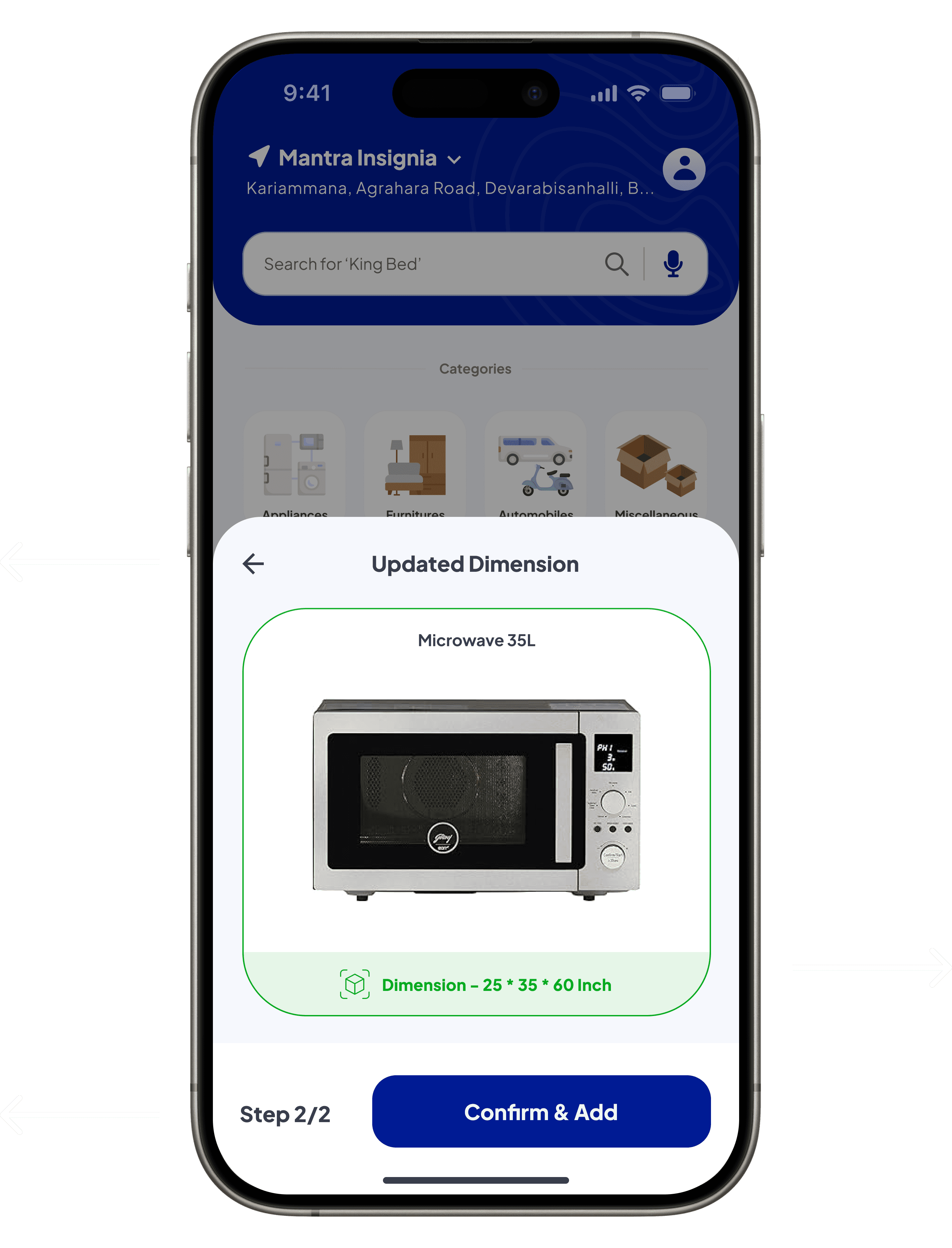
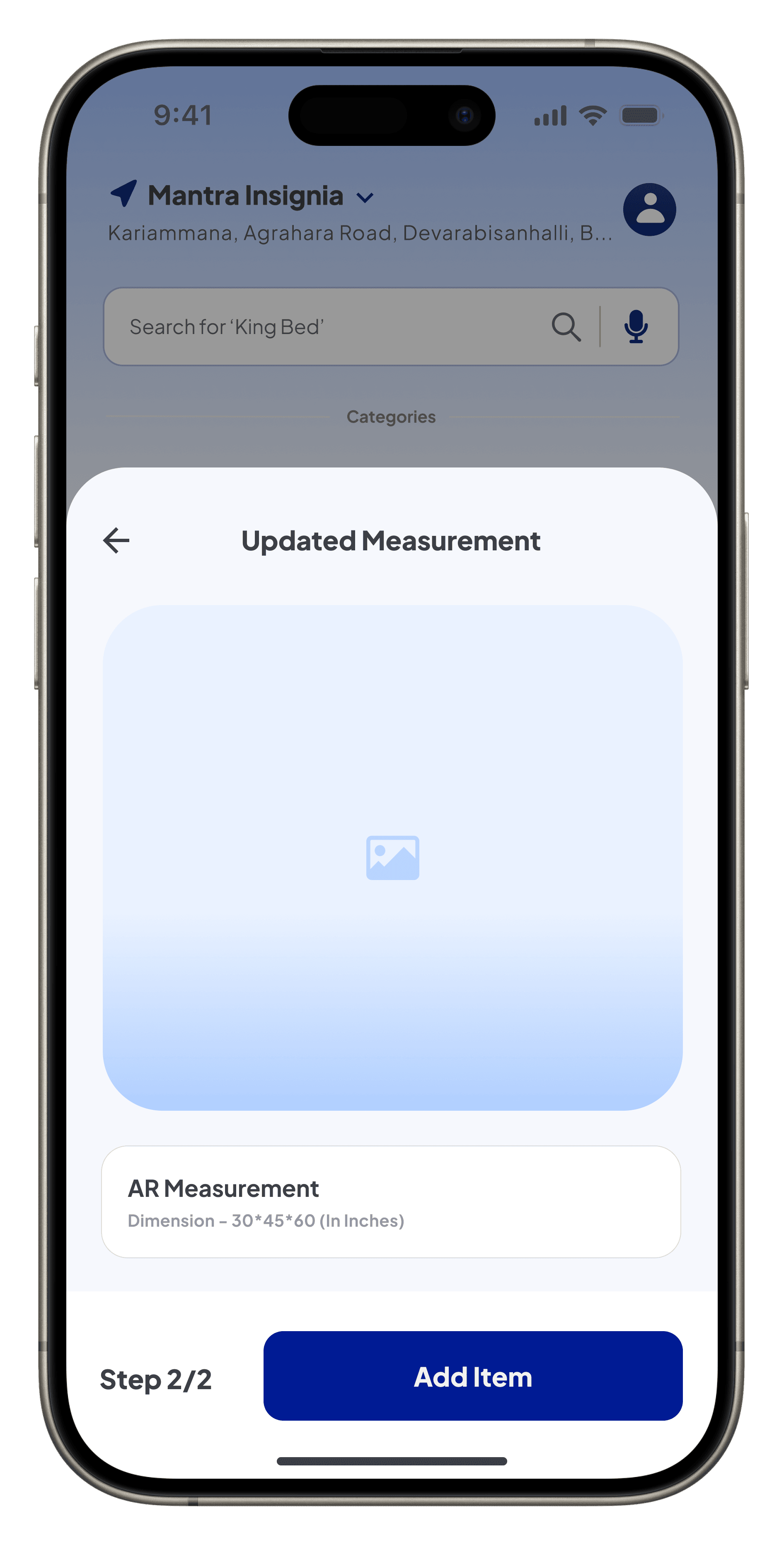
Reassures users with a clear heading, aligning with the task and building confidence in their progress.
Reinforces the accuracy and trust of the dimensions measured via AR by pairing them with a recognizable icon, ensuring users feel confident in the results.
Provides a sense of task completion with a bold, prominent button, guiding users to finalize the process effortlessly while reinforcing workflow continuity.
Initial Concept: Offered users the ability to measure items via manual input or AR, focusing on functionality but lacking clear guidance on the benefits and usability of each method. The AR integration was basic, with minimal contextual information or interactive feedback.
Final Design: Redesigned into a seamless, step-by-step process for measuring items with AR, emphasizing inclusivity and clarity. Key improvements include contextual guidance on measurement benefits, an intuitive AR experience, and a reassurance screen to build user confidence and ensure ease of use.
Now we know how to add an item, but how do we measure it? To make the process inclusive and user-friendly, there are three ways to measure your item, each tailored to different needs and preferences:
Augmented Reality
Benefits:
High accuracy and cost savings by avoiding potential mismatches.
Note:
Slightly time-consuming as it requires interaction with the AR tool.
How to Use:
Click on the “Not sure? Measure” link, then select the AR option to visualize the product in your space.
Manual Measurement
Benefits:
Offers control when technology fails or isn’t preferred.
Note:
Requires users to measure their space manually and input the details.
How to Use:
Click on the “Not sure? Measure” option, then select “Enter Manually” to input the dimensions.
Predefined Dimensions
Benefits:
Quick and efficient for those who trust the provided dimensions.
Note:
Best for users familiar with their space requirements.
How to Use:
Simply rely on the dimensions shared in the product details and proceed to add the item directly.
As an example, let’s explore how to measure with AR. Since the other two options—manual measurement and predefined dimensions—are straightforward and require minimal guidance, AR offers a unique way to enhance accuracy and interaction. The next section will guide you through how to use AR effectively to visualize the product in your space.
Home Screen
Initial Concept: Designed a basic list-based layout displaying product details, relying on manual navigation and filtering. While functional, it lacked visual hierarchy and efficient navigation tools, making interactions less intuitive.
Final Design: Redesigned as a visually structured interface with clear hierarchy and intuitive interactions. Contextual pop-ups streamline task completion, and improved accessibility enhances usability.
Initial Concept
Final Design

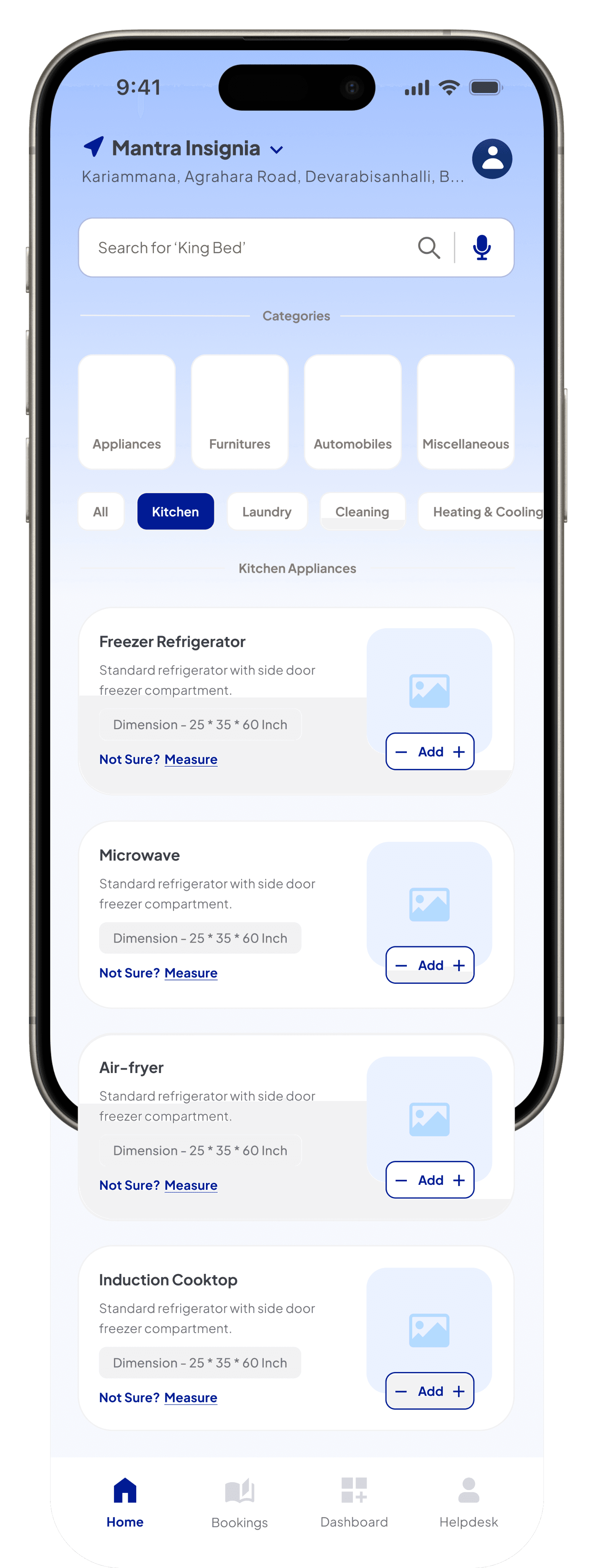
The profile and location section at the top ensures visibility of key account details, with an accordion for easy updates, improving accuracy and user control.
Positioned at the top for visibility and accessibility, the updated background enhances usability by making the search bar stand out.
Improved sub-filter with updated states and icons, enhancing visibility.
Refined category icons and labels improve scannability, ensuring quick navigation and task clarity.
The ‘Add’ button with options displays available variants, enabling users to select and add items to the cart directly for a faster checkout.
Bottom navigation is optimized for thumb reach, providing quick access to essential sections like Home, Bookings, and Helpdesk, improving overall accessibility.
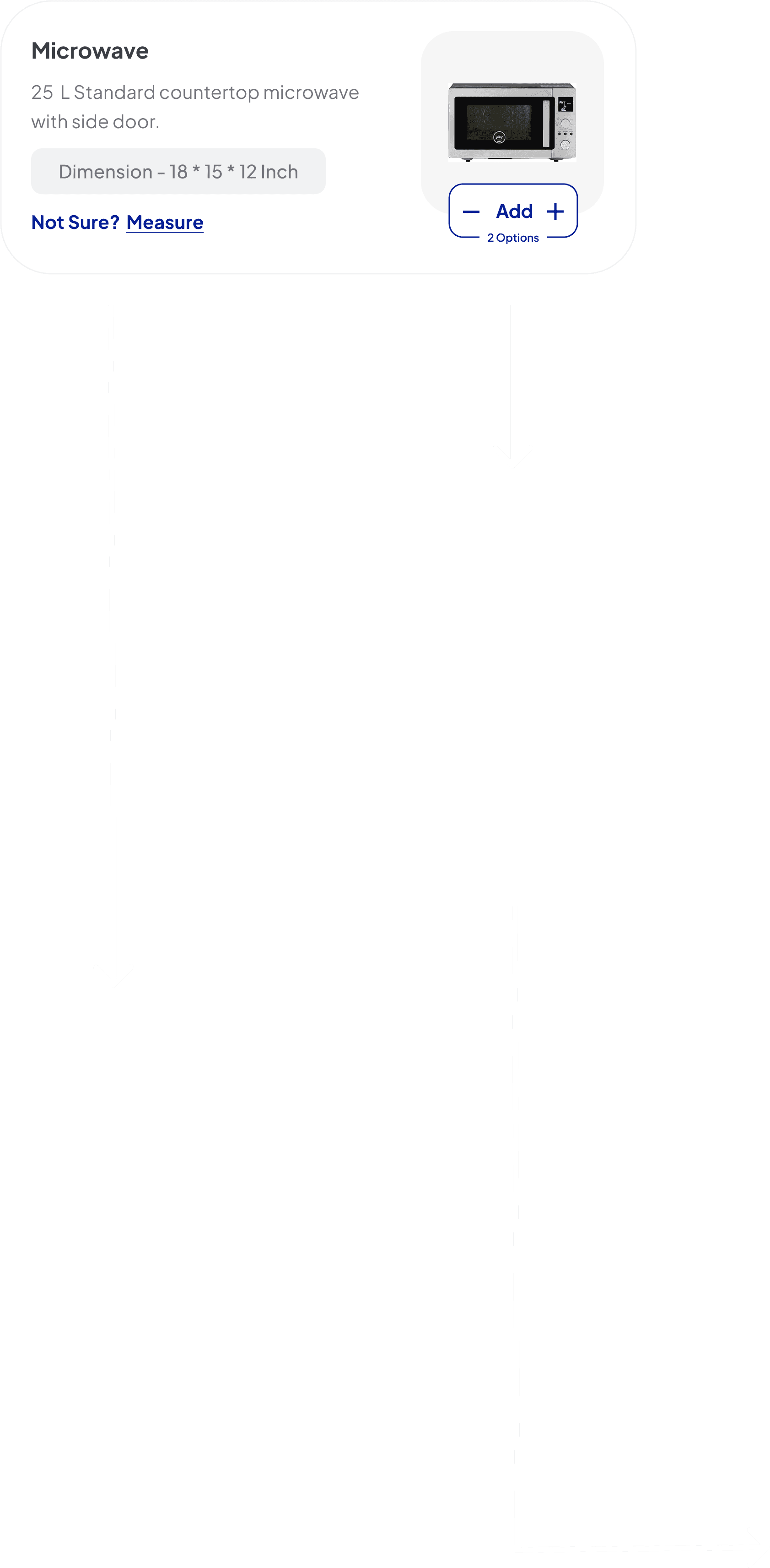
Displays key product details and a ‘Measure’ option, offering users the flexibility to confirm dimensions, ensuring precision and task alignment.
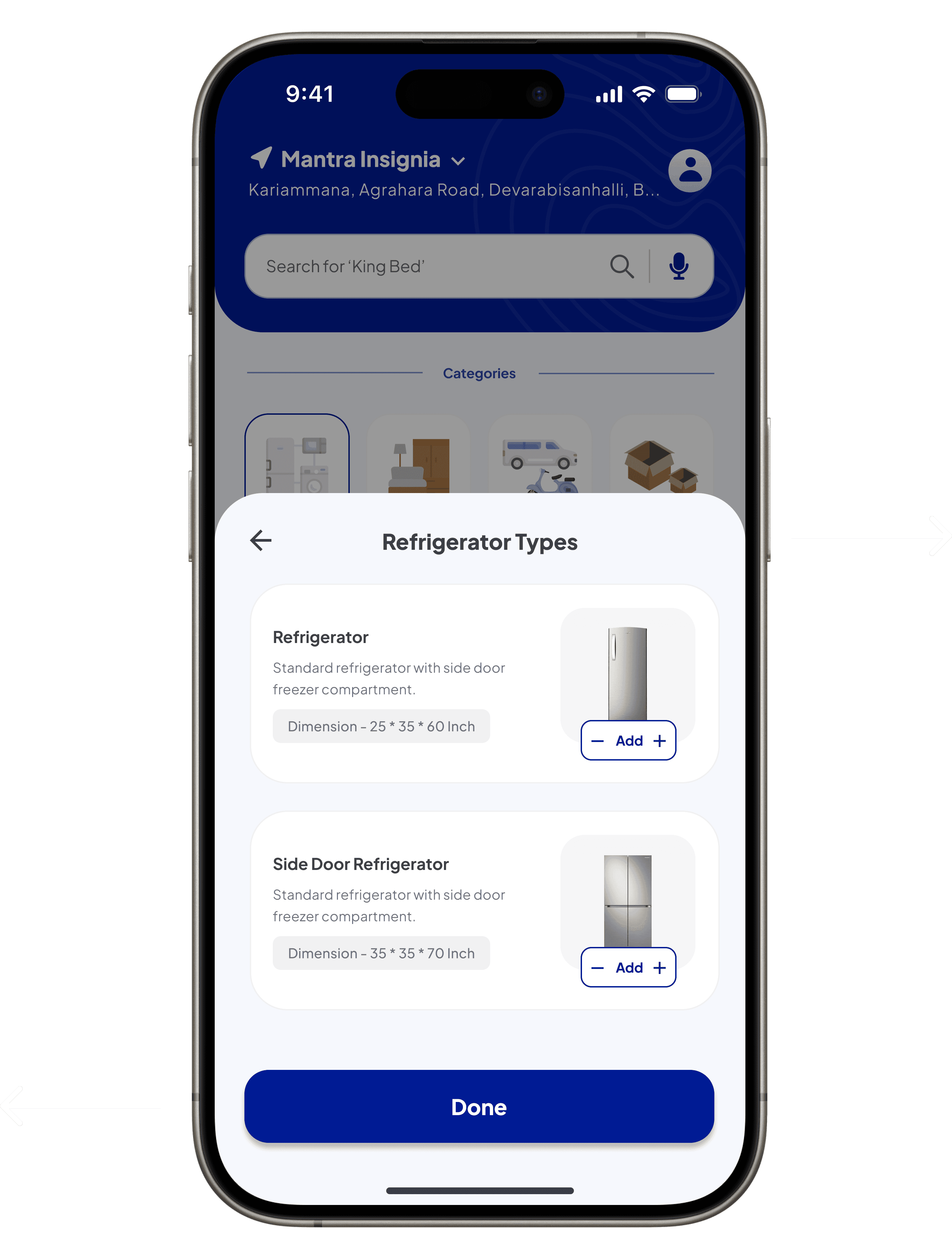
Integrates a contextual pop-up with a prominent heading, ensuring seamless interaction and reducing cognitive load by keeping the process intuitive.
The ‘Done’ call-to-action is at the bottom, confirming type or quantity selection and returning users to the main screen.
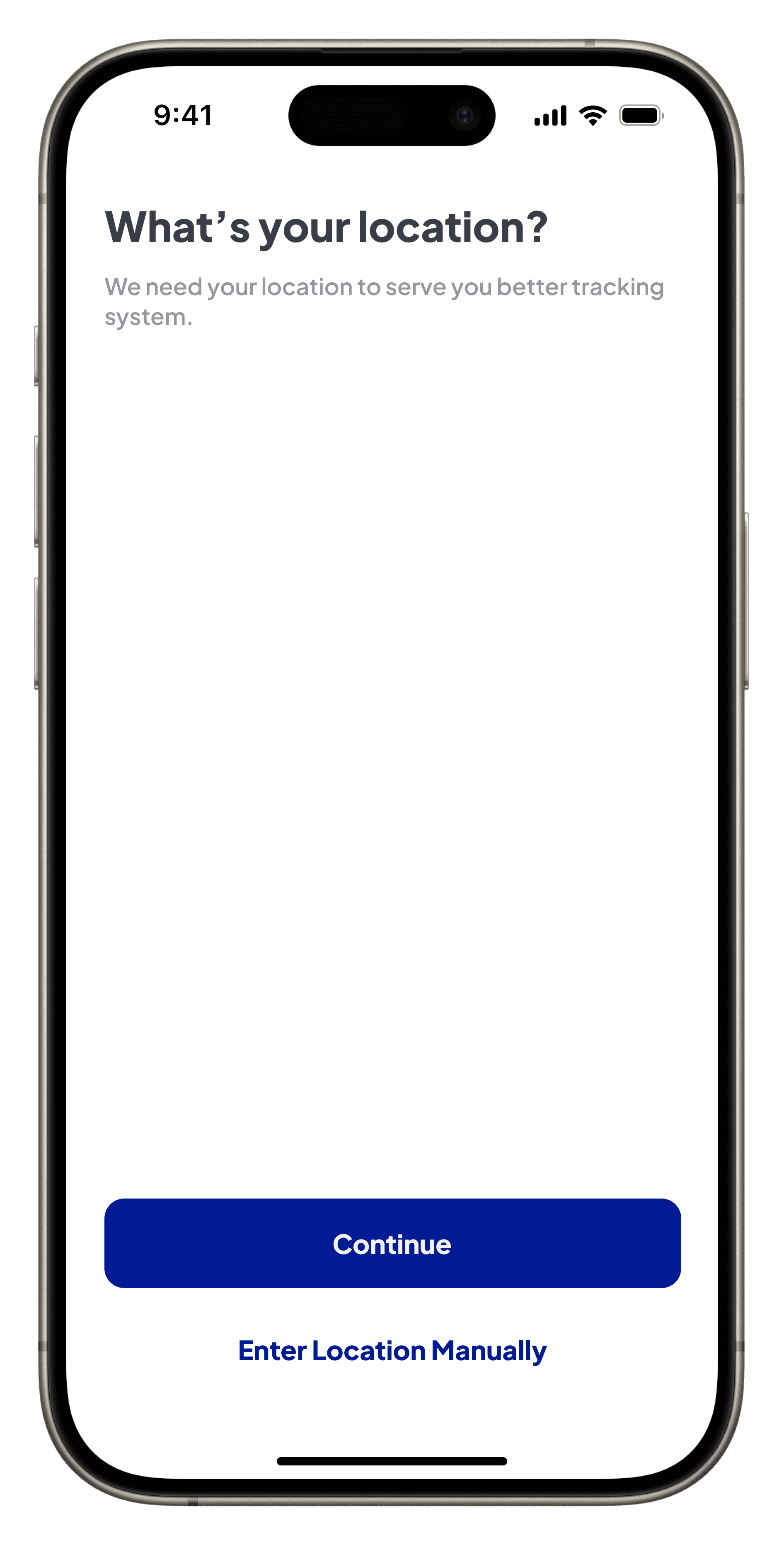
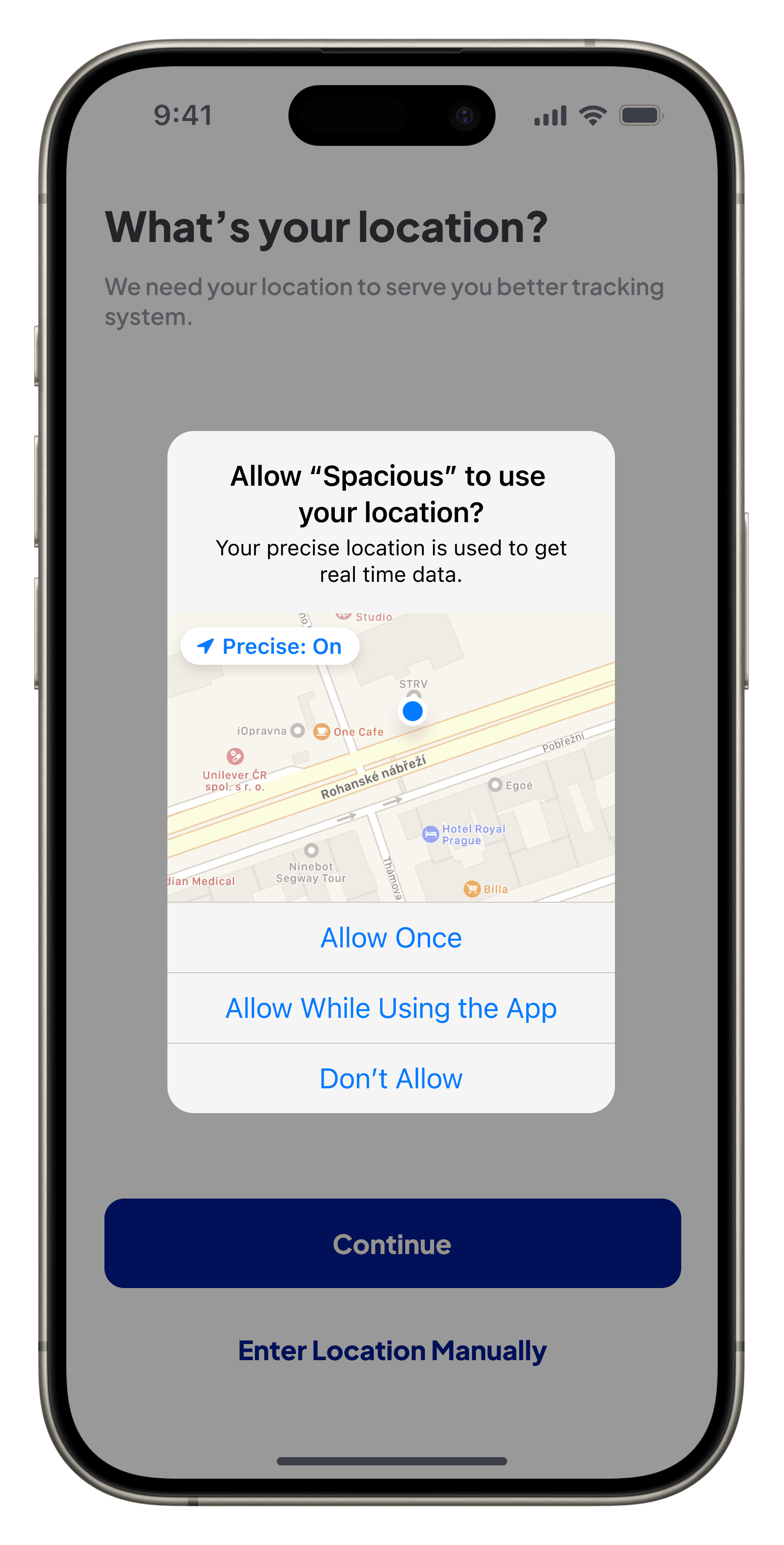
Location Enablement
Initial Concept: Designed a basic, minimal interface for collecting location information, prioritizing simplicity. However, it lacked options for flexibility and transparency, limiting user control over the process.
Final Design: Refined into a more user-centric design with detailed visuals, permission prompts, and manual input options. Updates like a clearer call-to-action and interactive elements enhanced transparency, user control, and the overall experience.
Initial Concept
Final Design
The central location pin visual reinforces location-based tracking, making the purpose of sharing location immediately understandable, even in a minimal interface.
Provides a manual input alternative, ensuring flexibility for users who prefer control over automated methods.
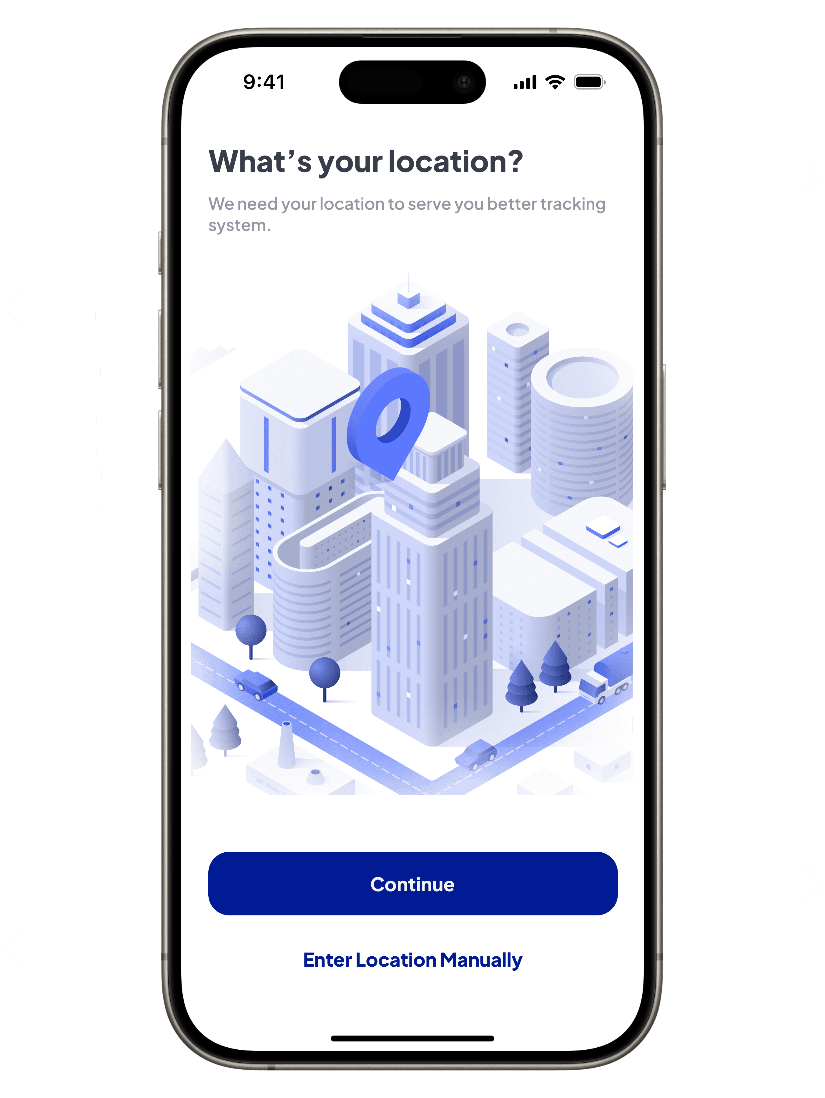
The bold heading and explanatory subtext improve transparency by clearly communicating the purpose of sharing location, reducing confusion.
The bold blue primary call-to-action encourages users to proceed with automatic location detection.
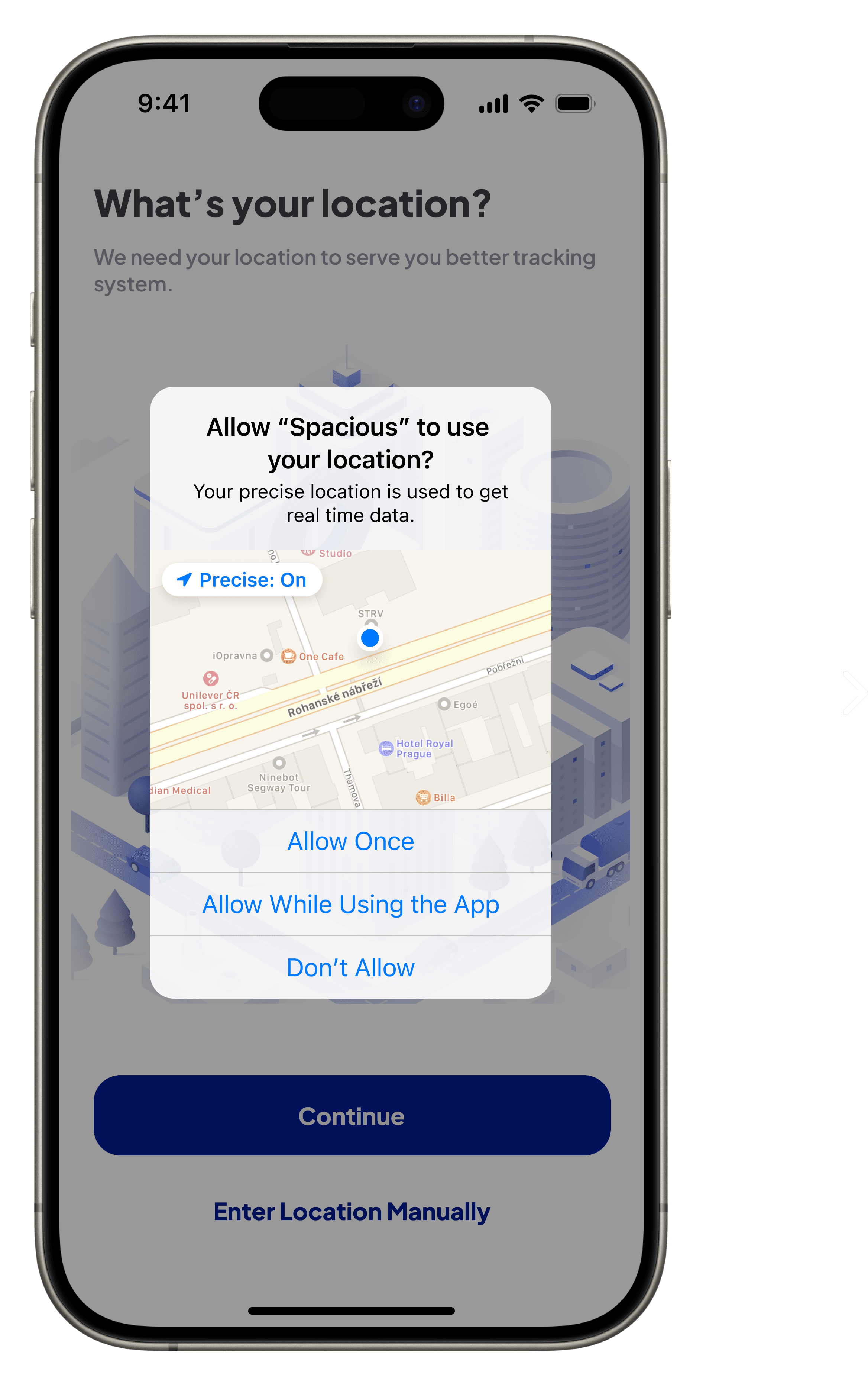
Permission prompt prioritizes user privacy, giving users explicit control over location sharing while adhering to transparency principles.
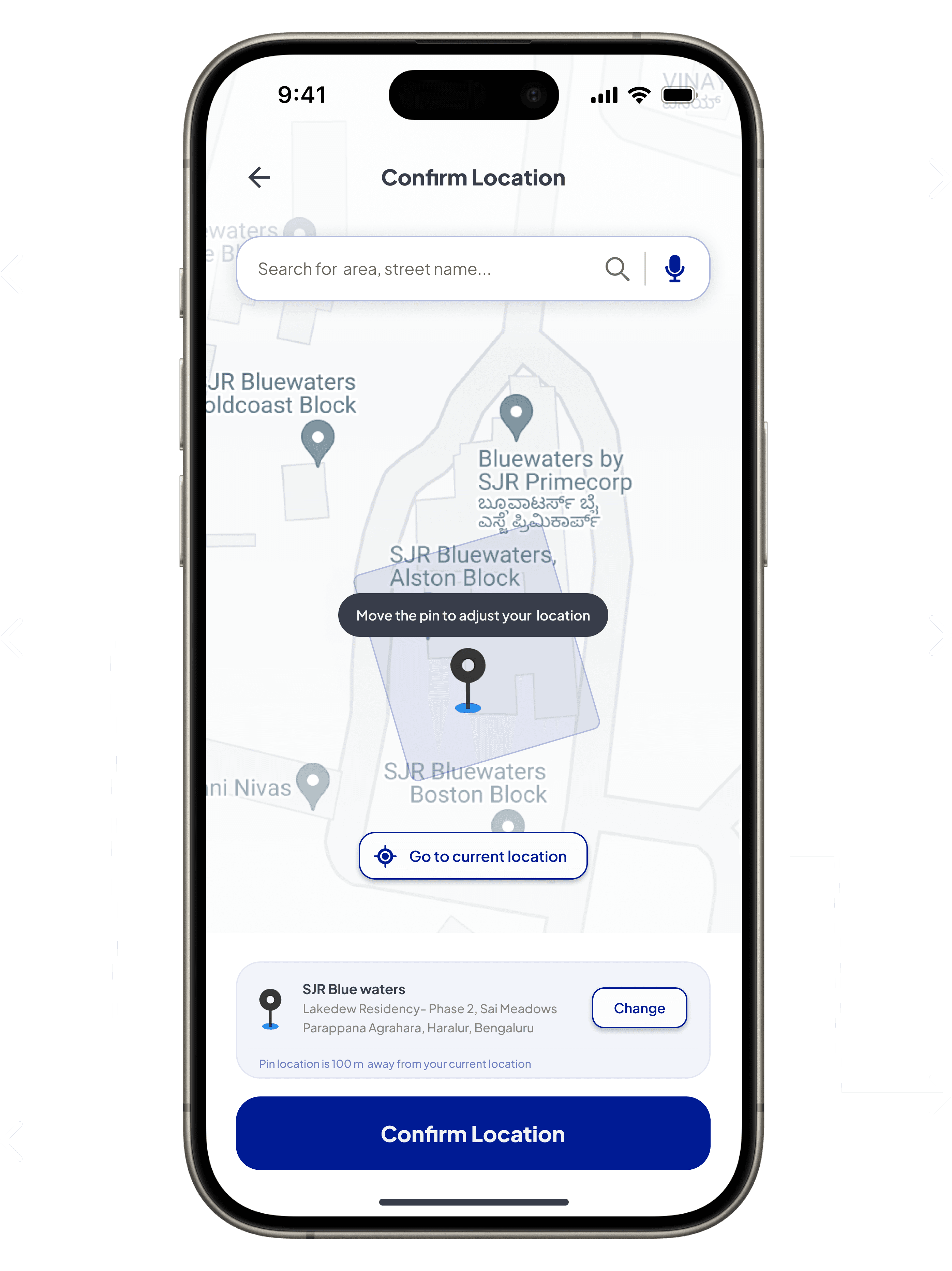
Enables users to manually adjust the pin to confirm a precise location, ensuring accuracy and personalization in location selection.
This call-to-action offers a quick option to auto-detect the user’s current location, placed within easy thumb reach to reduce friction and streamline the process.
The heading “Confirm Location” clearly indicates the purpose of this screen, guiding users to finalize their location choice with confidence.
Enables users to search or update their location with a clear change option, enhancing flexibility and personalization for diverse needs.
Displays selected location details with an option to change it, either by searching again or using the ‘Change’ button to ensure both transparency and flexibility.
Bold call-to-action ensures task completion, guiding users seamlessly to confirm the location and proceed confidently.
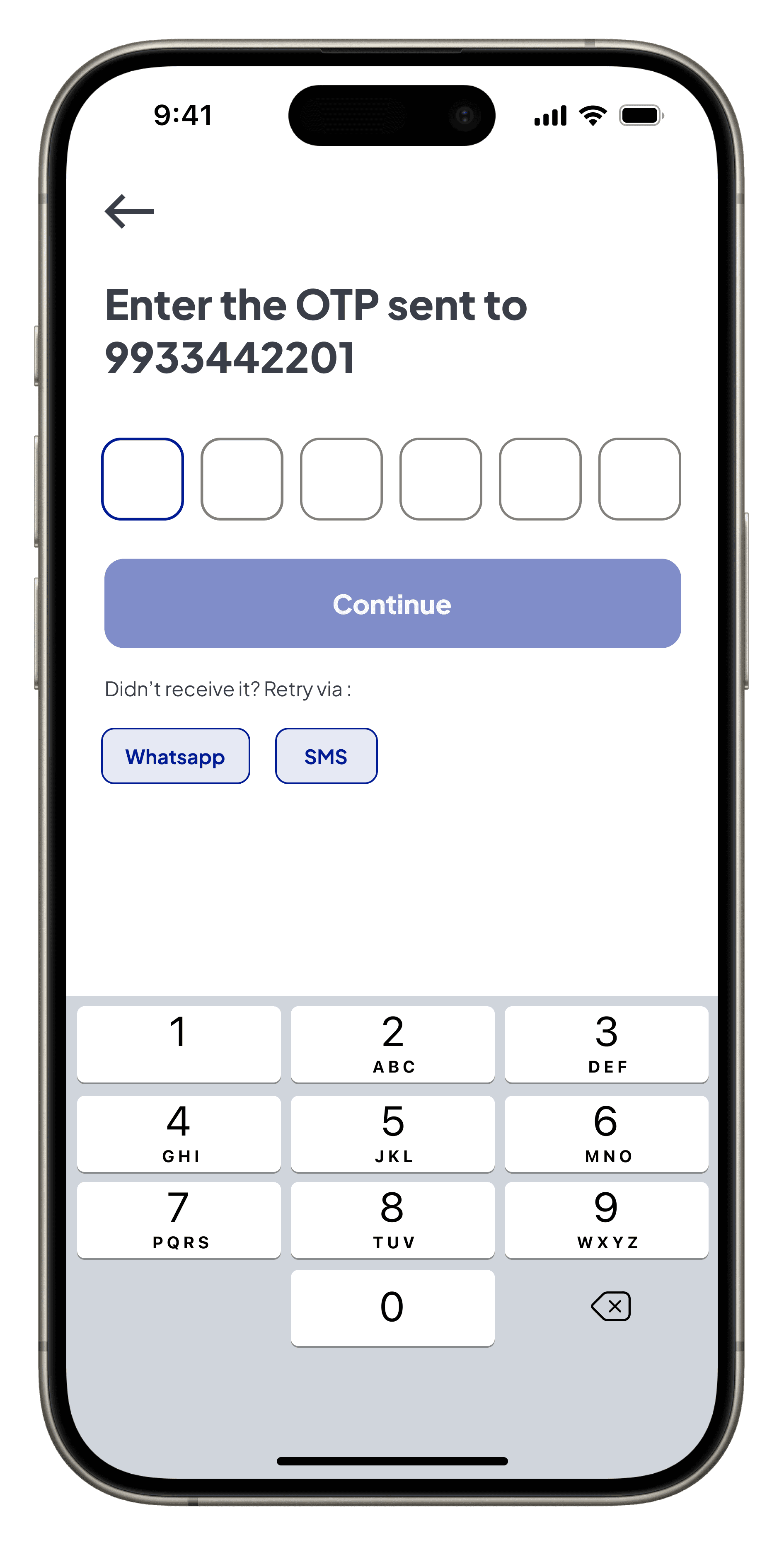
User Access
Initial Concept: Started with a simple and functional login flow, requiring manual entry for phone numbers and OTPs. While it was straightforward, the lack of pre-filled fields or retry options made the process less efficient.
Final Design: Evolved into a more user-friendly design with pre-filled phone numbers, automated OTP detection, and retry options. Enhanced features like skip functionality and editable input fields improve flexibility, speed, and overall user experience.
Initial Concept

Introduces a back call-to-action to ensure navigation continuity, allowing users to easily correct errors or revisit steps.
Changed “Enter your mobile number to get OTP” to “Enter your mobile number” for a more concise and focused screen, simplifying the initial step for users.
Changed “Get OTP” to “Continue” to reduce cognitive load and create a more universal action, maintaining interface consistency.
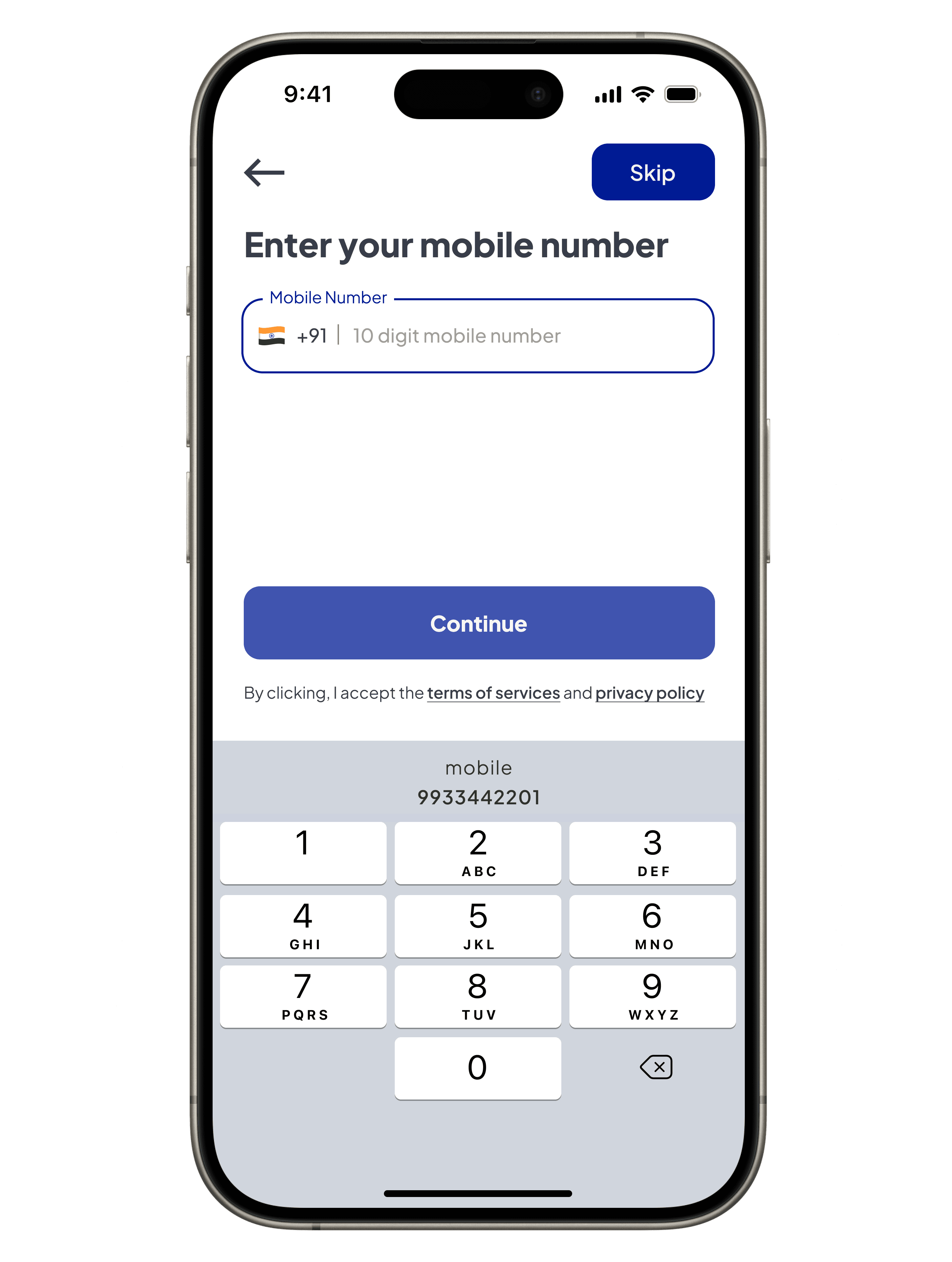
A skip button gives users the flexibility to bypass login and explore the app, catering to different entry preferences.
Pre-filled phone numbers eliminate manual input, reducing friction and improving accuracy in format entry.
Pre-filled phone number replaces manual entry, reducing friction and speeding up the process for accurate format entry.
Final Design
Changed from “Enter the OTP” to “Enter Verification Code” for a more concise and focused screen.
Countdown to make users aware of when the next OTP can be requested.
Redesigned retry options for WhatsApp and SMS enhance usability by offering multiple recovery methods with clear visual cues.
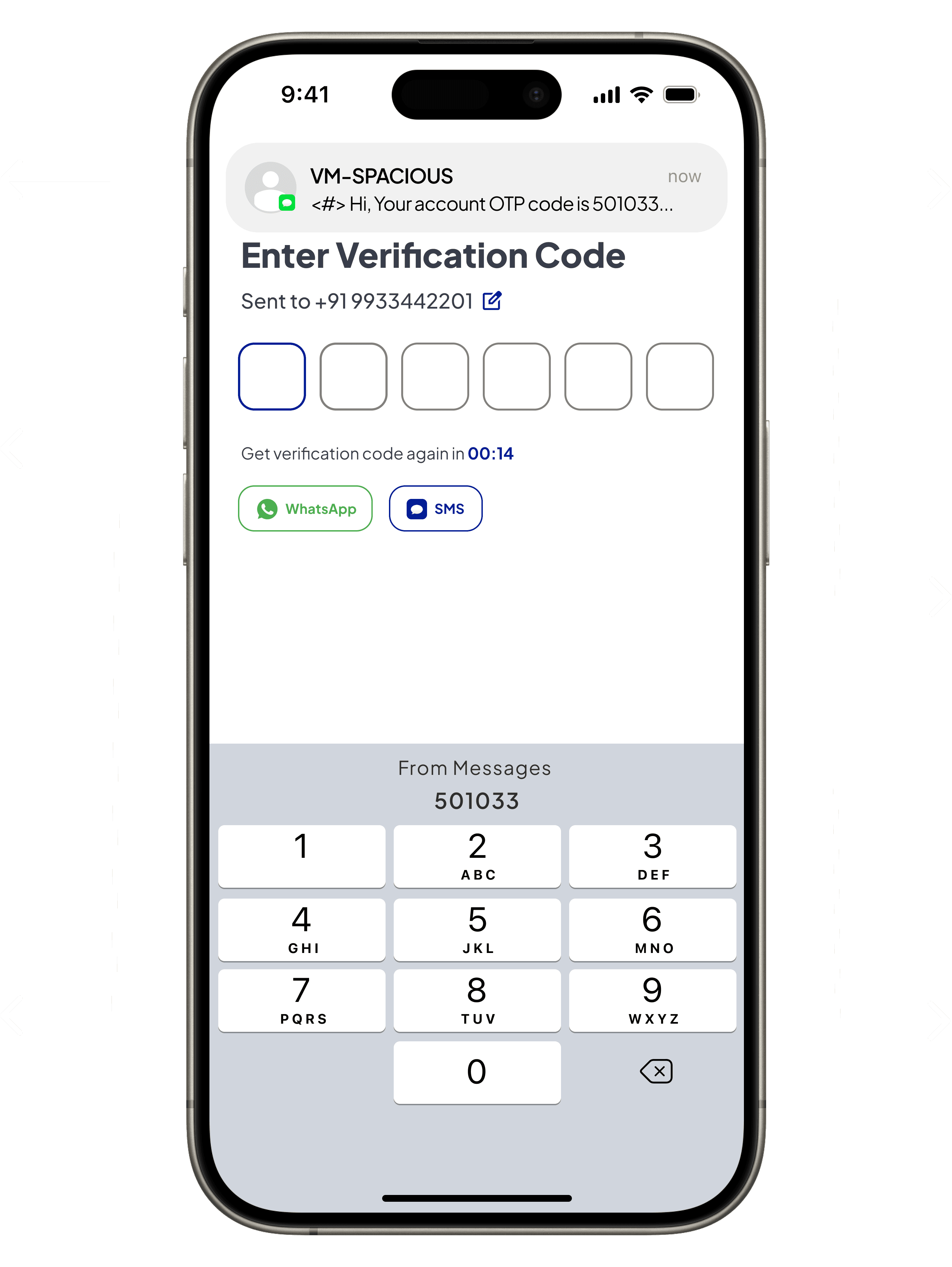
System-generated OTP messages improve visibility, ensuring users can review and enter the code efficiently without confusion.
Enabled editable phone number field to correct errors, enhancing flexibility and user control.
Automated OTP detection replaces manual input, removing unnecessary actions to reduce cognitive load and speed up the process.
In-depth market analysis highlights clear gaps and untapped opportunities in terms of cost-effectiveness, flexibility, and user needs. The competitive landscape offers insights into how existing solutions stack up, revealing potential areas where newer, more agile offerings can thrive. Here’s what the market reveals -
Established Self-Storage Companies
• Source - The Tribune India
• Summary - Offer reliable, long-term storage with various unit sizes but are often costly and inflexible.
On-Demand Storage Providers
• Source - Warehousing Express
• Summary - Provide flexibility and convenience but may have limited storage space and higher costs.
Local Movers and Packers
• Source - Leo Packers and Movers
• Summary - Offer storage as an add-on to moving services, which can be less flexible and more expensive.
Real Estate Developers
• Source - Economic Times
• Summary - Integrate storage units into commercial properties, offering convenience but with higher costs and less flexibility.
Data shows the problem—But does the indian market?
Market Overview
SWOT Analysis
To gain a clearer understanding of these dynamics and identify opportunities for improvement, a SWOT analysis will help us evaluate the strengths, weaknesses, opportunities, and threats within the current market landscape. This approach will offer strategic insights that drive the design of more user-focused and cost-effective solutions.
Strengths
Established Infrastructure and Security : Real estate developers and established self-storage companies have strong physical infrastructures, providing customers with large, secure storage spaces. This appeals to users who require long-term for their belongings.
Customer Trust & Brand Recognition : Larger established players, particularly in self-storage, enjoy strong brand recognition. Customers are likely to trust these companies for their consistency and reliability, especially for long-term storage solutions.
Weaknesses
High Costs : Real estate developers and established self-storage companies operate at a higher price point, which alienates cost-sensitive customers. The focus on premium services means they are less accessible to a broader market looking for more affordable options.
Limited Technology Integration : Most established players are slow to adopt newer technologies like real-time tracking and app-based management, making the customer experience less seamless compared to what more flexible or tech-driven solutions could offer.
Threats
Economic Downturns : During economic slowdowns, customers may opt for more affordable solutions or even forego formal storage altogether, relying on informal networks. This would particularly hurt high-cost players like real estate developers and premium storage providers.
Price Sensitivity : As the market grows more competitive, price wars could emerge, especially if larger competitors reduce their prices or adopt more flexible terms to retain market share. This could pressure newer companies to lower their margins or enhance service offerings .
Opportunities
Innovation and Digital Transformation : On-demand storage providers have started to make inroads here but have not fully dominated. This is a market space where leveraging mobile-first platforms, automation, and enhanced user experiences, could stand out significantly.
Affordable and Flexible Solutions : With the high costs and rigidity of the dominant players, there’s a large gap in the market for solutions that provide both affordability and flexibility. This could cater to underserved segments with short-term storage needs.
Onboarding User
Initial Concept: Started with minimal visuals and swipeable screens to introduce app features simply, aiming for a straightforward and engaging onboarding process. However, the design lacked real-world alignment, making features less relatable for users.
Final Design: Transitioned to real app screens for a more visually complete design that aligns with user expectations. The updates improved feature recognition, added actionable messaging, and leveraged typography and interactive cues to foster engagement.

Initial Concept
Centrally placed to establish a basic visual focus, ensuring users can quickly identify the key features despite the minimal design.
Updated text to reinforce trust and emphasize live updates, focusing on clarity and alignment with the app’s core message, using bold typography for better readability.
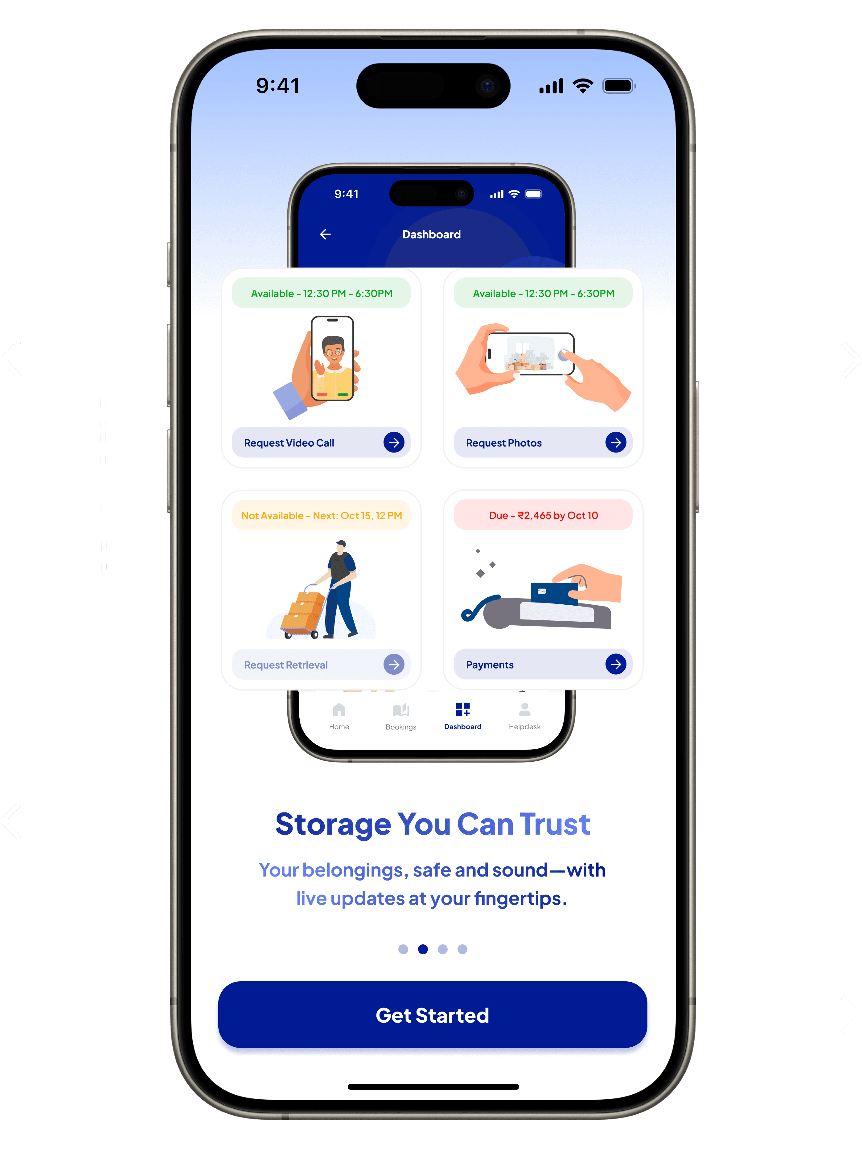
Final Design
Slider dots act as navigation aids, introducing users to swipeable interaction while maintaining focus on updates and navigation clarity.
The bold blue CTA is optimized for mobile-first usability, positioned for thumb accessibility and visually guiding users to proceed seamlessly.

Let’s bring the solution-based design to life.
Welcome to Spacious!
The name ‘Spacious’ embodies the mission to deliver secure, flexible, and convenient storage solutions tailored for urban environments. Inspired by the dominance of iPhones in Tier 1 cities (where Apple commands a significant market share, Economic Times), the solution prioritizes iOS design first, ensuring an intuitive user experience for the primary target audience.
The iterative design process focused on enhancing clarity, functionality, and user experience while adhering to Apple’s Human Interface Guidelines for a seamless and consistent design language. A scalable design system was created to adapt easily across platforms, ensuring readiness for future expansion to Android. Current design decisions rely on market research, with usability testing planned to validate and refine the experience further.

With possible solutions - Information architecture
The following mind map visually represents the app’s structure, breaking down each feature and flow derived from the possible solutions.

Now, let's validate the real problem.
To understand the scope of the problem and how it affects users across different demographics and expectations, results from surveys conducted across various age groups and residents in different tiers reveal the true picture -
42%
Tier 1 Cities
Location Distribution
Summary
With a high concentration (42%) residing in Tier 1, followed by 28% in Tier 2, and a lower concentration (16%) in Tier 3 cities.
Key Insights
1. Tier 1 cities have a higher demand for paid storage services due to a more individualistic lifestyle, less reliance on neighbors, and limited family support. Residents are more likely to turn to professionals for storage solutions.
2. Tier 2 and Tier 3 cities show lower demand for professional storage services. The stronger social ties, reliance on neighbors, and extended family support allow residents in these areas to manage temporary storage needs informally.
40%
25-34 Years
Age Distribution
Summary
The need for temporary storage spans all age groups, with a high concentration (40%) in the 25-34 age demographic.
Key Insights
1. Young Professionals (25-34 years) are the primary users of temporary storage solutions, as they are more likely to move frequently for career opportunities, work remotely, or live in rented apartments.
2. Older age groups (35+) may require storage services less frequently as they are more likely to be settled in permanent homes and rely on longer-term storage solutions or informal family arrangements.
50%
Safety & Security
Summary
Only 20% of respondents had prior experience with storage facilities, but they prioritize security (50%) when choosing storage options.
Key Insights
First-time users may be cautious and prioritize security features before trusting storage providers, expecting high levels of safety assurance.
Key Insights
First-time users may be cautious and prioritize security features before trusting storage providers, expecting high levels of safety assurance.
54%
Price & Transparency
Summary
Cost is a significant consideration, with users valuing flexible budgeting options (54%). Transparent pricing and information are crucial.
Key Insights
Users are highly cost-conscious, seeking short-term, flexible storage solutions with clear and upfront pricing to avoid hidden fees.
15%
Climate Control
Summary
There is a growing importance for climate control (15%), indicating a need for solutions catering to sensitive items.
Key Insights
Growing demand for climate-controlled storage, particularly in Tier 1 cities, driven by sensitive items and valuable items.
< Spacious >
Simplifying Storage
Looks solid, right? Let’s break down how I got here.
But before we dive into the details, here’s a quick overview.
My Role & Collaborators
I facilitated the research, collaborated with design mentees to uncover key user insights, and independently crafted the design strategies and solutions based on our findings. My responsibilities included overseeing user research, analyzing user needs, and translating insights into actionable design strategies and solutions.
Is this a real problem?
Managing belongings during temporary transitions—whether due to frequent relocations, remote work, home renovations, extended travel, or other life changes—continues to be a challenge. Traditional storage solutions in india are often too rigid, requiring long-term contracts and high costs, and they lack transparency in terms of pricing and service availability.
Did i face this real problem? Yes!
I personally experienced this issue when I had to keep paying rent on an apartment I wasn’t using just to store valuable belongings. While working remotely, I didn’t need these items, but they were too important to part with. Traditional storage options were far from ideal—most required long-term commitments like three- or six-month contracts, hefty deposits, and high costs. On top of that, many solutions were web-only with no convenient mobile apps for quick management. This led me to wonder—was my experience unique, or were others facing similar struggles? To break out of my own assumptions, I decided to dig deeper and validate this issue through broader research, understanding the pain points faced by others.
Market & data checks out - But what do users truly need?
While market and data highlighted some obvious gaps, user interviews revealed even deeper frustrations with traditional storage models. Throughout these open-ended discussions, participants not only shared their pain points but also began to explore alternative solutions they wished existed—solutions that could better address their needs for affordability, flexibility, and trust.
User Need
Affordability
Convenience
Flexibility
Security
Community Trust
Tech Accessibility
Pain Point
User Experience
High costs of traditional storage
“Storage facilities charge too much, especially for short-term needs,” shared a young professional.
Lack of nearby storage options
“For home renovations, I need something close by, but all the storage options are too far away,” said a homeowner.
Long-term storage contracts are restrictive
“As someone who travels for work, I need a flexible solution without a long-term contract,” mentioned a frequent traveler.
Concerns over belongings’ safety
“I’m worried about how safe my things will be in a traditional unit,” said a retiree concerned about theft and damage.
Lack of trust in larger cities
“In my hometown, I knew my neighbors, but here in the city, finding someone trustworthy is much harder,” shared another user.
Limited mobile-friendly storage applications
“Most storage services are web-based. I need something quick and accessible on my phone,” said a tech-savvy user.
Problem validated, Let’s explore possible solutions
It’s clear that users need affordable and flexible storage options that also provide security and convenience. From the 40% of users struggling with the high cost of traditional storage to the 54% seeking short-term, flexible solutions, the pain points are evident: affordability, accessibility in urban areas, and a lack of trust in available options. Addressing these needs, several solutions emerged through solo brainstorming and the use of a priority matrix to evaluate and prioritize the most viable ideas.
Flexibility & Cost-Effectiveness
User Need:
Users in Tier 1 cities are looking for flexible, affordable storage options with a sense of community and trust.
Possible Features:
Hybrid Storage Model: Combines peer-to-peer storage for cost savings with traditional warehouse storage for secure, short-term needs.
Cost Savings for Smaller Items: Peer-to-peer storage allows users to store fewer items at a lower cost, while fostering community connections.
Tiered Pricing Models: Offers flexible pricing based on storage size and duration, ensuring users pay only for what they need.
Trust-Building Features: Includes video calls and photo requests between users and hosts to verify trust and ensure transparency.
Convenience & Tech Accessibility
User Need:
Users want seamless access to storage options with an app that reduces friction and offers smooth onboarding.
Possible Features:
Mobile-First Platform: A mobile app for booking, tracking, and managing storage with ease.
Smooth Onboarding: A frictionless setup process that allows users to quickly understand the app’s features and begin using the service.
Feature Awareness: Built-in onboarding flows with tooltips to educate users about key features like AR measurement, real-time tracking, and seamless payments.
AR & Measurement Tools: Helps users accurately measure their items to ensure optimal space usage and cost savings.
Community Engagement & Transparency
User Need:
Users need a transparent system that enables informed decision-making, while also feeling a sense of trust.
Possible Features:
Transparency of Information: Provides clear details about storage costs, host reviews, and available space to help users make informed choices.
Community Interaction Tools: Introduces user ratings, feedback options, and the ability to communicate with hosts for added transparency.
Localized Recommendations: Suggests peer-to-peer storage options based on user location, fostering community-driven solutions.
Trust-Building Activities: Offers social proof through host ratings, past user experiences, and real-time interaction features to enhance trust.
Security & Trust
User Need:
Security and trust are critical, especially in peer-to-peer storage environments, where users need assurance of safety.
Feature Benefits:
Real-Time Monitoring: Offers live updates on the security status of stored items, providing users with peace of mind.
Enhanced Security Features: Includes host background checks, insurance options, CCTV, and biometric access for secure environments.
Host Verification & Reviews: Implements host verification along with community-driven ratings and reviews to build trust within the peer-to-peer model.
Transparent Safety Measures: Clearly outlines security protocols, and host reviews to provide full visibility into safety.
Defining success metrics through (KPIs)
Tracking success is essential for validating a product’s effectiveness and ensuring it meets user and business goals. For this new product, where testing isn’t feasible yet, carefully defined KPIs (Key Performance Indicators) will act as benchmarks to evaluate its performance. These metrics are designed to capture user engagement, operational efficiency, and overall product impact—spanning from onboarding and user information intake to post-payment processes and dashboard interactions.
Onboarding Funnel Analysis
What to measure:
Time taken to complete the onboarding process, user progression through each step, and drop-off rates at critical stages.
How to measure:
Use Google Analytics or Mixpanel to track user flows, identify drop-off points, analyze each step, and highlight stages where users face delays or abandon the process entirely.
Form Completion Rates
What to measure:
Completion rates of forms, drop-off rates at fields, and time taken to successfully finish the process by users.
How to measure:
Analyze form submissions and drop-offs using analytics tools like Hotjar. Track time spent on fields and collect user feedback to improve problematic steps in the form flow.
Payment Retry Analysis
What to measure:
Success rates of payment retries, time taken to retry payments, and user choices for alternative methods used.
How to measure:
Monitor retry attempts and completions through payment analytics. Track user behavior during retries, focusing on time-to-complete and payment method changes in failed transaction scenarios.
Feature Engagement Tracking
What to measure:
Engagement rates of core features, completion rates of tasks, and frequency of use across a defined timeframe.
How to measure:
Use session tracking, heatmaps, and analytics tools like Mixpanel. Focus on click density, session length, and underutilized features to improve usability and engagement metrics effectively.
Empty State Conversion Rates
What to measure:
User actions after empty states, including CTA clicks, time spent, and engagement with suggested options.
How to measure:
Use analytics tools to track user clicks on CTAs, measure time taken to proceed, and evaluate whether users successfully convert from the empty state experience into meaningful actions.
Dashboard Heatmap Analysis
What to measure:
Frequency of dashboard visits, interactions with sections, and engagement levels across all dashboard.
How to measure:
Use heatmaps and scroll tracking tools to evaluate user interactions, click density, and popular sections while identifying underused areas requiring better visibility or functionality upgrades.
Designed with love intent and crafted with purpose © 2025. All Rights Reserved by Jayant.